
Bplans Brand Update
Bplans, a business planning blog and resource guide, needed design help. The existing Bplans branding was dated and extremely inconsistent. Newer ideas were in use alongside older ones and there was no unifying direction. When we decided to redesign the site and use a design system, a coherent brand update was necessary.

Logo Update
The bones of the logo weren’t terrible, the icon concept was clear and distinctive. So instead of completely redoing it, I gave it a subtle update. The typeface was replaced with the new font I chose for the new brand direction, and the icon was subtly tweaked to match the new style sensibility of the rest of the site. Finally the color palette was updated to include the new Bplans blue that I developed.
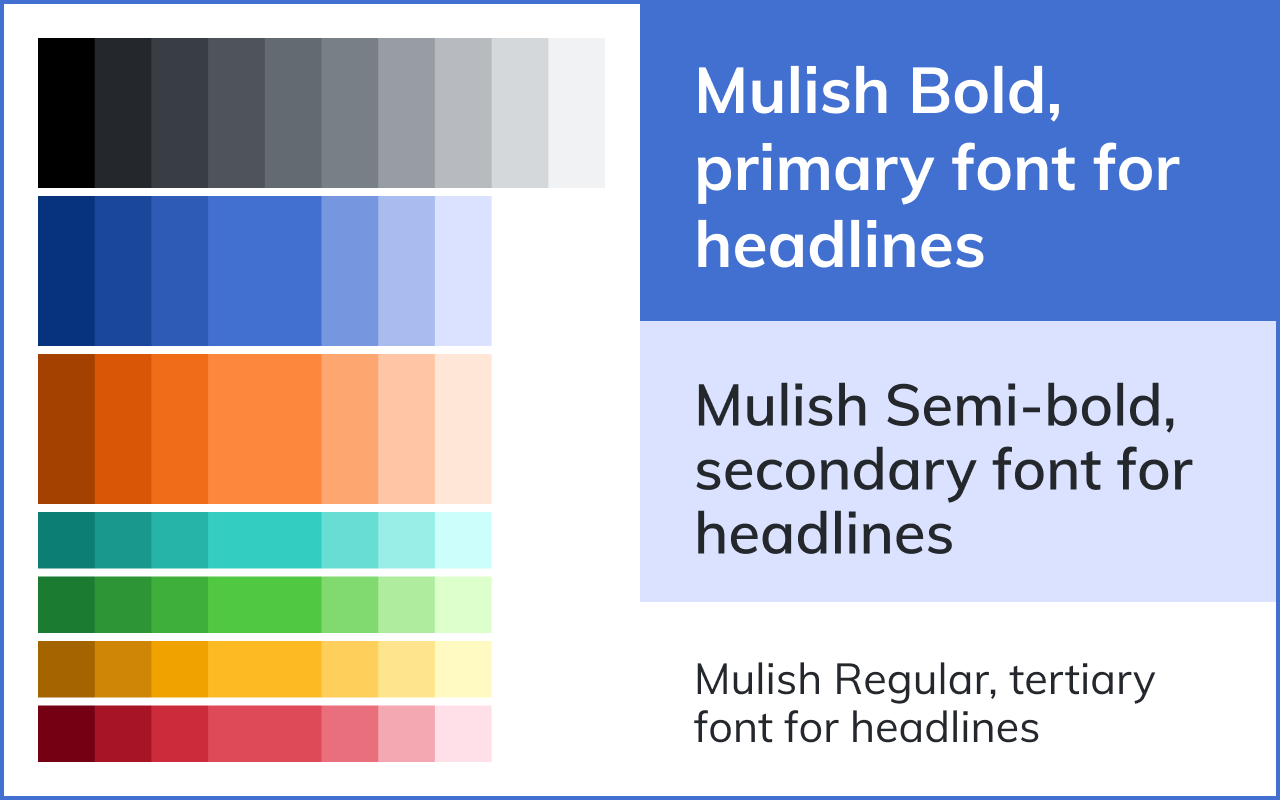
Color
The color palette features an updated blue; more of an indigo that feels more contemporary. Orange was a natural choice for an accent color and played well in button ctas. Other accent colors were also added to give some variety and enable full-color illustrations to be made. The gray color codes were also reworked and actually became the standard grayscale that would be global for all of our sites. When I build a color palette I like to have a color family, with a full range of values for each color. I also use a design token naming convention, like $teal-100, with the name representing the color family and the number representing the shade. This makes it easy to systematize, and even expand the color family if that becomes necessary.
Type
I chose the Mulish typeface because it’s crisp and reasonably formal while style having a bit of style and uniqueness. We wanted the Bplans brand to feel authoritative yet friendly, and I feel that this typeface works well for that.
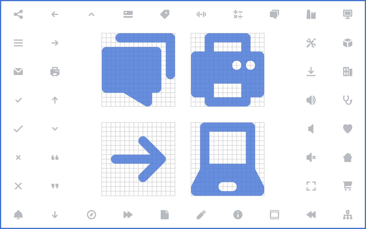
Icons
I built a custom icon library for Bplans. Making icons is something I enjoy, as it’s an opportunity to add a lot of polish and design quality to a brand. I start with a few simple rules to make all the icons match and to speed up the design process. Everything aligns to a 16x16 pixel grid, and features 2px line elements with rounded corners. Fill is solid. Bplans had a need for a number of general purpose icons along with high-level categories. Bplans also has a number of sample plan categories that needed unique icons.

Art Style
I started with some off-the-shelf stock vector graphics to hone in on the style we wanted to go with for Bplans. This would give some reference to the brand guide and ensure consistency when any custom illustrations are made in the future. We decided on a fairly straightforward cartoon style, not too stylized, with no facial details, and some abstraction regarding content. The full color palette is really useful here as the illustrations can have a bright and colorful presence.
This represents the highlights from the Bplans brand update. I ended up building out a full brand guide with all of this and more to guide the website redesign that was also happening around this time. I’ve become a big fan of documentation, getting ideas out in a form that makes it easy for others on the team to contribute and carry on the work.