
LivePlan Brand Update
This project is something I put together in between my regular projects. The LivePlan brand was in need of an update and I had been thinking about and experimenting with new directions for a long time. This work is the best of all the ideas and directions explore.
The overall brand direction goals were to make something clean, calming, and established. I wanted the visuals to be simple, but effective, almost understated, with a dash of playfulness in key areas.

Logo Refresh
I proposed making this the new logo. It’s similar to the current logo in general concept, but is entirely new, it feels like a continuation. The bar chart inspired icon is now more geometric, which matches the brand aesthetic of using simple shapes. The typeface is new and utilizes the new typeface chosen as part of this rebrand proposal.

Color
The color palette is really simplified and lends itself to bold, flat color blocks with lots of white space. the navy blue is the primary color and is used as a background for hero elements. Green and orange are accents that play off of it well. Overall, I think it’s clean and mature, which plays into the branding goals we developed.
Type
The font chosen is Montserrat. I’ve always liked this font so I was happy to build some branding around it. The feel of it is a little bit fun and friendly without being too wacky. I also find this font works really well in all-caps with some extra letter spacing, which is a nice element to have in your back pocket.
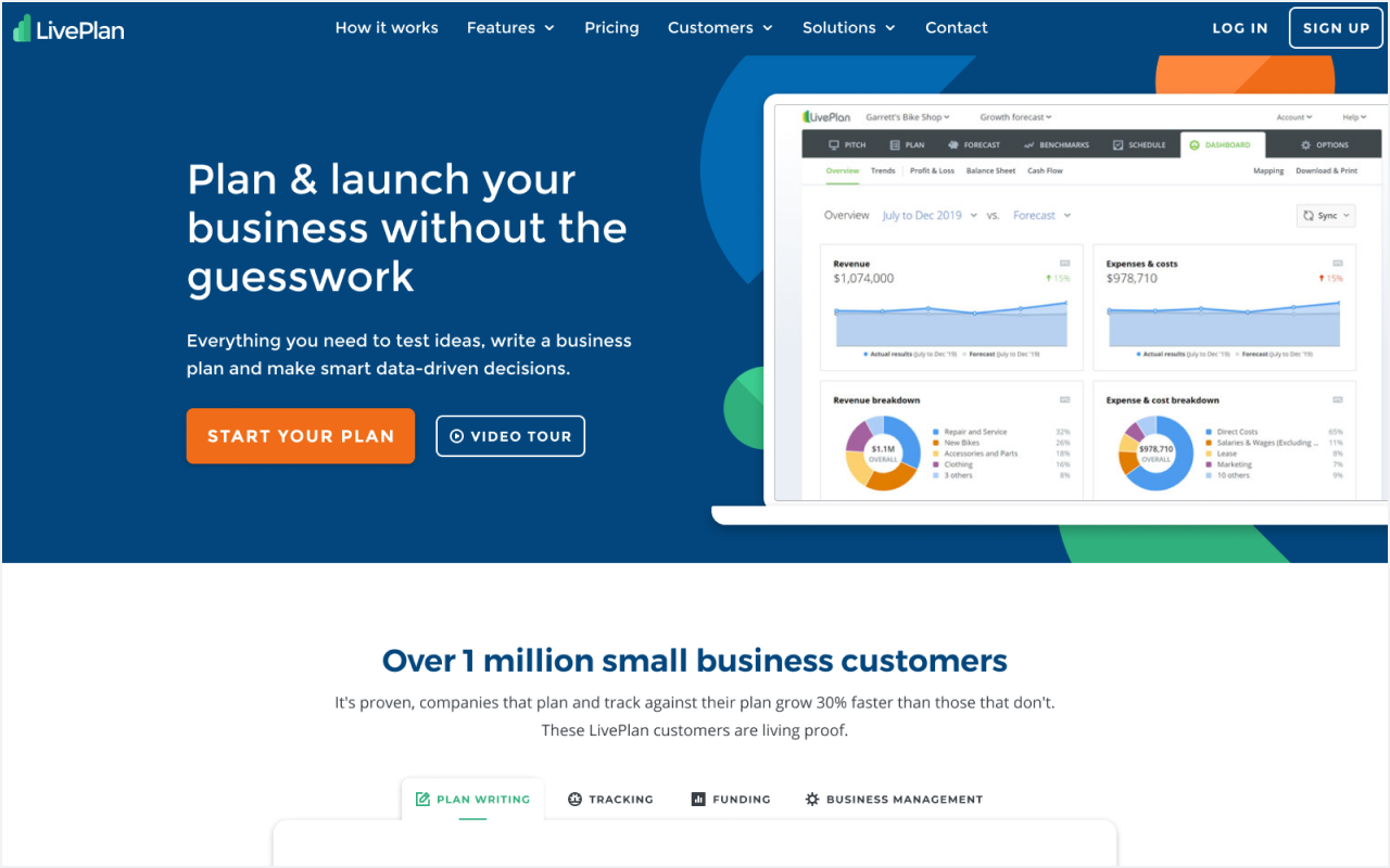
The Web
Here are the branding ideas applied to a homepage hero. The Navy Blue background is bold without being too in-your-face, and the orange cta is just enough pop. The geometric shapes add some life and interest to the section, and give us an opportunity for some subtle animation, as well as a recognizable brand element we can carry through the rest of our site.

Big Picture
Overall, I find this brand direction to be simple but effective. The use of color is straightforward and has a clear hierarchy, and the use of white space keeps pages feeling light. It should be easy to build this into a design system, apply it to any print collateral, and translate to an application use case.