
Outpost Homepage
Here is a full redesign of the homepage for Outpost. The previous iteration was a basic “MVP” type of page, this one represented an opportunity to go with a more polished look, as well as clearer communication of product features, and ultimately better conversion.

Hero
The main hero section is meant to have a really clear call to action as well as a detailed, high-level product overview, all presented above the fold.
Gradient
How do you make a predominantly blue page feel bright and sunny? use a long, tall gradient that mimics the color change on a blue sky.
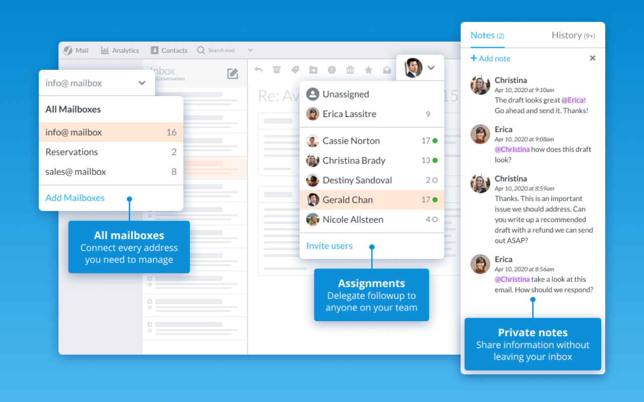
Product Overview
I created this custom vector graphic as a representation of the product and the key features we wanted to highlight. The highlighted features are brought forth with more color, a strong elevation, and the base of the app being simplified and free of unnecessary details. The callout boxes provide direction to get a sense of the app features quickly.

Expanded Features
This below-the-fold section provides much more features details. We have more custom artwork representing more app features here. There’s also some easy bullet points with icons and accent colors to give some more life to the page.

Extra Branding
We also use a paper airplane graphic to add some more visual interest and life to the page, and create something we can use consistently as part of our branding. I created the folding process graphics to add a sense of progression (plus it’s fun), they pick up the blue gradient theme from earlier.