
Palo Alto Software Website
Our own company website was long neglected and in need of a total redo, so we planned a redesign project. Redesigning it was a great opportunity to do a full-site project and build a consistent vision across the board.
I started by establishing a new brand look and feel. We recently redesigned the logo but didn’t have anything else, so I built from that by drawing inspiration from a mural in our office that featured a cool polygonal mountain range. Building from that, I established a fairly simple look and feel, using a limited color palette, lots of white space, bold use of typeface, and use of a diamond shape. Defining these rules made the site design project much easier to execute and ensured consistency where previously ideas were clashing and competing.

Homepage
The homepage hero features the vector art mountain range I developed as a signature visual for our brand, on scroll it has a nice parallax effect. I use a lot of implied lines on this site design, with the boundaries of the header, hero, and lower section being suggested.
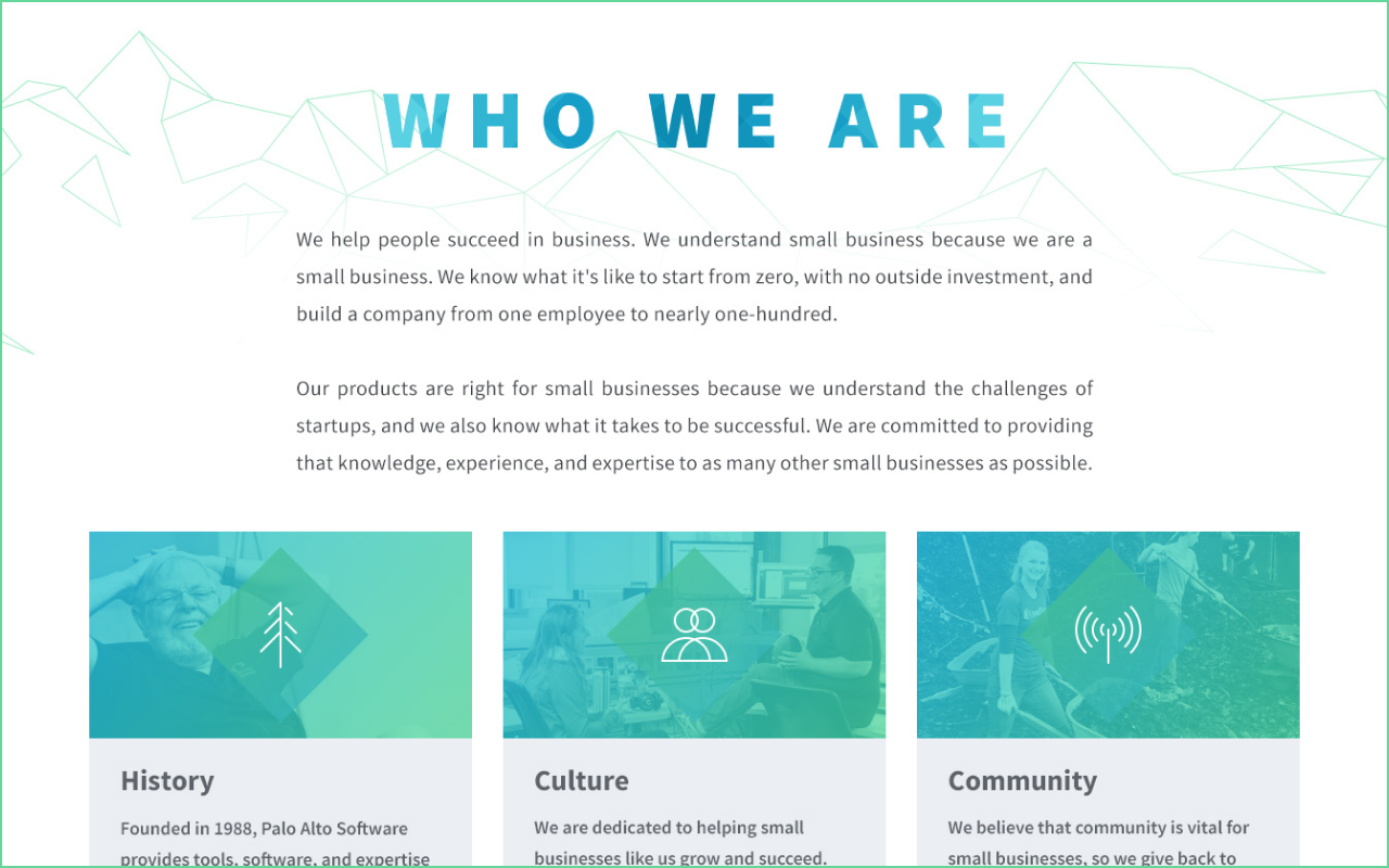
Secondary Pages
All secondary pages have a consistent page hero formula, with a large, bold headline and a continuation of the wireframe mountain style. Each of the top-level pages featured in the navigation has a unique mountain design.
The card style here showcases the image gradient overlay, use of the diamond shape motif, and the custom iconography I developed for this project.

Continuation
The careers page is a continuation of the same look and feel. photos of our employees were an important part of the design criteria and you can see that here.

Custom Iconography
Also on the careers page, more examples of the custom icon design and diamond motif.

404 Page
I wanted to do a custom 404 page for this project as a way of paying attention to details and going above and beyond. It was also a great opportunity to be more personable with our brand by displaying a drawing from the children of our employees. Each page load randomly chooses a new one.
The site footer pays homage to our northwest location by including forest imagery blending seamlessly into the page.