
Anthology Vol.01
‘Anthology’ is a series of pieces made as stand-alone works of art, not tied into a larger series. These range from sketches and experiments to large scale and time-intensive works. Presented in chronological order, these pieces often represent a moment of discovery. Ideas explored here can come to full fruition in a future series. Vol. 01 starts with the last of my collegiate work in 2011 and finishes with a test image that leads into another series.
Table of Contents
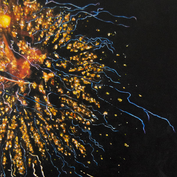
Fireworks

Title: Fireworks
Artist: Luke McCready
Date: January, 2011
Medium: Oil on Canvas
Size: 36 x 48 inches
4th of July
This piece was one of my earlier full-size oil paintings that I did as a student. The reference photo came from a photoshoot I did during the previous 4th of July. I took a lot of photos at the fireworks display that year, and this one was my favorite. The streaky lights at the bottom are actually street lights.
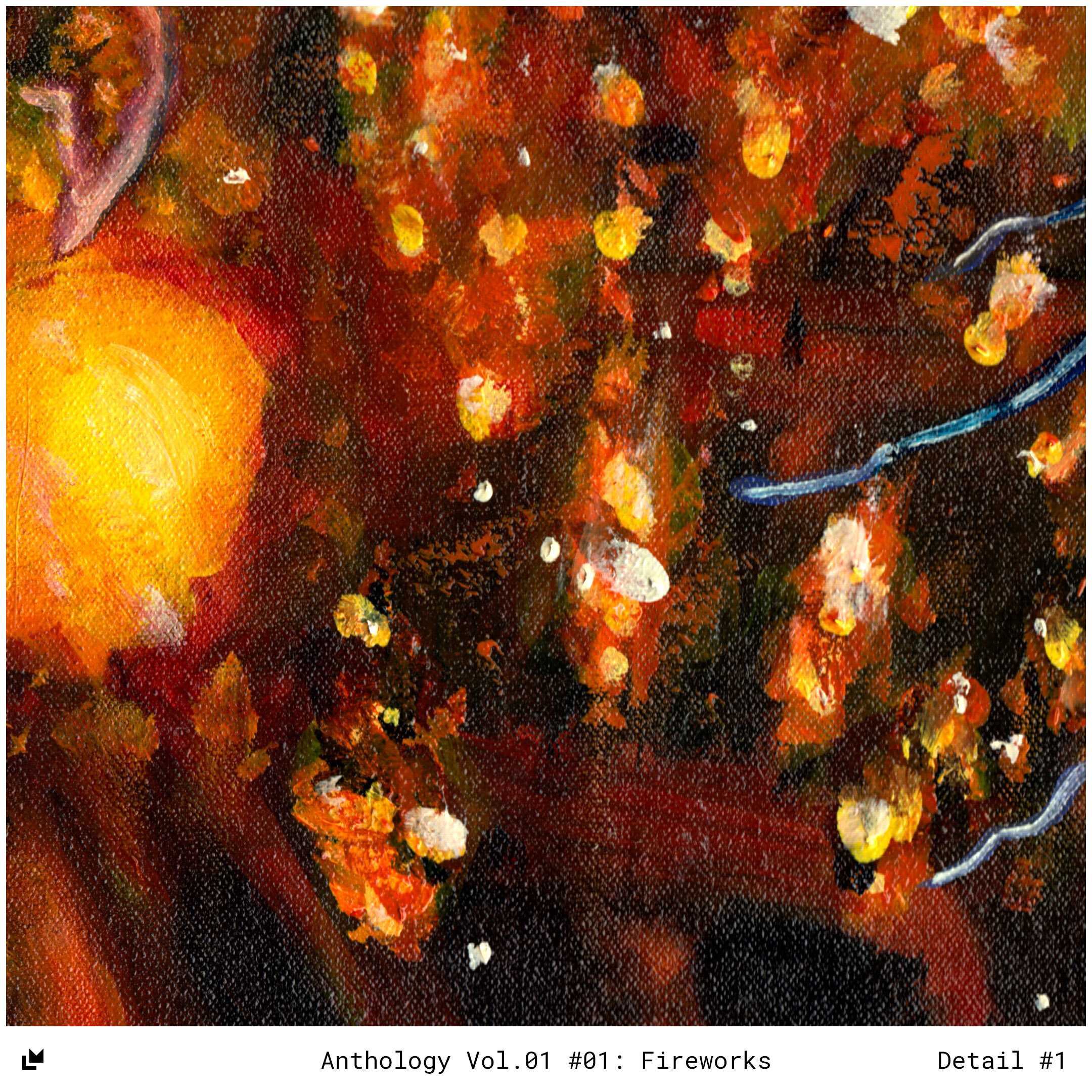


Light and dark
The challenge with this image was how deceptively precise the details needed to be. I initially thought that the abstract and globular forms could be put in haphazardly without much thought, but I discovered that I needed to be much truer to the reference photo than I thought.
As a result I had to repaint much of this in order to get it right. Crisp highlights with just enough blur, all on a black background proved to be a challenge, but it came together in the end.
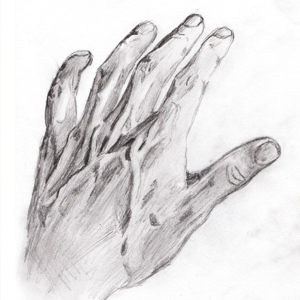
The Back of My Hand

Title: The Back of My Hand
Artist: Luke McCready
Date: April 1st, 2012
Medium: Pencil on Paper
Size: 8 x 10 inches
Killing time on a plane
As a right-handed artist, my own left hand is a readily available subject matter. I’ve done many observational sketches of my hand over the years and this one is my favorite. I did this drawing on a plane coming home from Ecuador. It was dark, the lighting was low, everyone else was asleep, and it seemed like the best use of my time.

A sense of volume in space
The main reason this sketch works so well is the proportionality of the hand, it has a sense of volume and accuracy to the form of the real thing. The drawing technique is sketchy and unrefined but the values are right, and in the right place, which is all that really matters for the success of a drawing. Observational drawing is a weakness for me, so I’m pretty proud of this one.
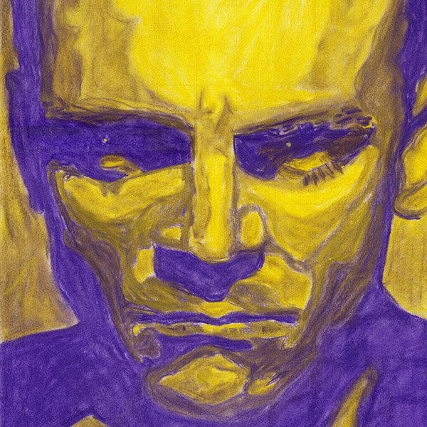
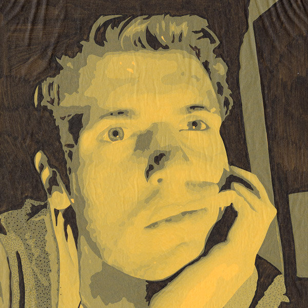
Cagney Pastel

Title: Cagney Pastel
Artist: Luke McCready
Date: Winter 2013
Medium: Chalk Pastel on Paper
Size: 16.5 x 27 inches
A pre-Kurick Kubrick stare
During my last year of college I took a lot of art classes and did a wide variety of one-off pieces, this being a good example of that.
The reference photo is one that I found online of classic film actor James Cagney. I’m a big classic film fan, and I keep a healthy backlog of reference photos from that era. As soon as I found this one I knew I had to use it in something because it’s such a striking, well-lit image. It’s also a fascinating example of the Kubrick stare, years before Kubrick would arrive on the scene.

Contrasting color replacing value
This piece is done in chalk pastel, a medium I hadn’t really used before. I enjoyed working with it well enough, especially since it was a good way to utilize color.
I wanted to experiment with replacing ordinary black and white with contrasting colors. I chose purple and yellow, mostly because orange and blue are really played out, I thought the purple/yellow contrast would be particularly sinister.
Overall, this image came together really quickly without much attention to detail, although I did use a grid. The roughness is ok with me, I think it adds a little something.
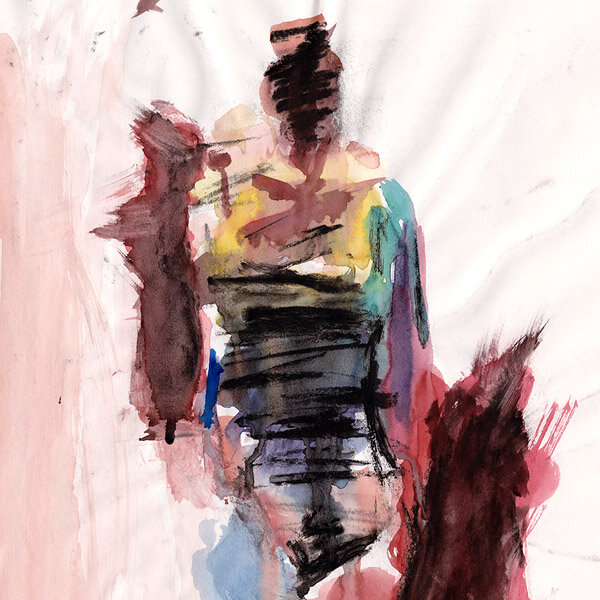
Abstract Figure

Title: Abstract Figure
Artist: Luke McCready
Date: Spring, 2013
Medium: Charcoal & Watercolor on Paper
Size: 18 x 24 inches
A rare moment of spontaneity
This is definitely the biggest stylistic departure I’ve ever taken with art. My usual style is very technical, pictorial, and pre-planned. This piece was an attempt at a totally abstract, in the moment sketch, done in probably 20 minutes. I believe we had a live subject to draw from.
Overall I’ve always enjoyed this piece, although the success feels accidental. It always strikes me as something someone else did, like I’m not looking at my own art.

Let it warp
The medium for this is watercolor and charcoal. I usually use watercolor with pre-stretched paper to prevent warping (something that drives me nuts) but this was done on a loose sheet so the warping is plentiful. Ultimately, I think that actually ads to the spontaneous and imperfect nature of the piece. Plus, the peaks of the warped paper got charcoal rubbed on them through general handling and that ads to the textured look.
The Modern Pose (Triptych)

Title: The Modern Pose (Triptych)
Artist: Luke McCready
Date: March 2013
Medium: Ink on Overlayed Engineering Paper, Photoprints
Size: 50.5 x 48.75 inches
A complex experiment
This is a very experimental art piece I did during my senior year of college. The central idea here came about when experimenting with semi-transparent engineering paper. I realized that layering sheets could alter the perceived value of the base layer. I could create a full range of values with only solid black shapes.
The reference image, one I took of myself, was chosen because of the strong light and dark range. The pose, as referenced in the title, is an individual staring rather mindlessly at a computer in a dark room, something the modern human finds themselves doing with great frequency.


Construction Process
I started by mirroring my source image because I wanted the ink on each sheet to be on the back side of the paper, which would un-mirror the image in the end.
I needed to divide my image into regions of solid shapes that represented a specific value range. I did this in Photoshop using posterization (and black and white). I chose 10 levels of value, 8 shades of gray with black and white. I then made a full-scale drawing outlining the boundaries of these value zones and numbered them 1 through 10 representing light to dark.
I then used this outline drawing as a reference. I took another sheet of engineering paper and traced over my outline drawing, filling in each zone of a particular number. I repeated that process 9 more times with 9 more sheets of engineering paper.
Once these 10 sheets were filled in they could then be layered together. The sheets representing the lightest values need to be at the bottom of the stack because that puts more layers of paper above them, making them lighter.
The end result is an image that closely approximates the original image, but done in a new and an unusual way.

The end result
Overall, I find this work more successful as an exploration of an idea than a work of aesthetic quality. Something I didn’t account for was the difference between linear and exponential division of the value range. The posterization filter is a linear division, meaning the visual difference between 10% gray and 20% gray is the same as 80% and 90%. The layered sheet technique, on the other hand, is exponential. The difference between the two darkest values (the top of the stack) is pretty huge, while the difference between the two lightest values (the bottom of the stack) is extremely small. This leads to a final image that’s distorted from the original, with lighter values blown out. This is a fairly fundamental issue with this technique that I’ve worked to overcome in future pieces.
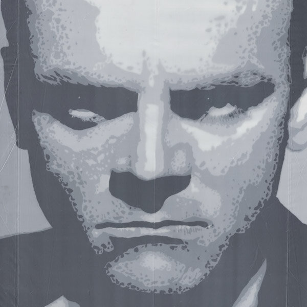
Cagney Plastic

Title: Cagney Plastic
Artist: Luke McCready
Date: Spring 2013
Medium: Black Acrylic on Layers of Plastic
Size: 22 x 36 inches
Experimentation, the sequel
This painting is a direct sequel to the main idea of the previous work, The Modern Pose. The gradation technique used here is the next step in the development of the layering idea explored previously, only this time using black acrylic paint and semi-transparent plastic sheeting.
The reference image is of James Cagney, the same one used for Cagney Pastel some months before. I sometimes use the same reference multiple times if I really like it, and this is a good example.
The quality of the values here feel very much like the black and white photography of the period.
This was the last art piece I did in college, just before graduation.
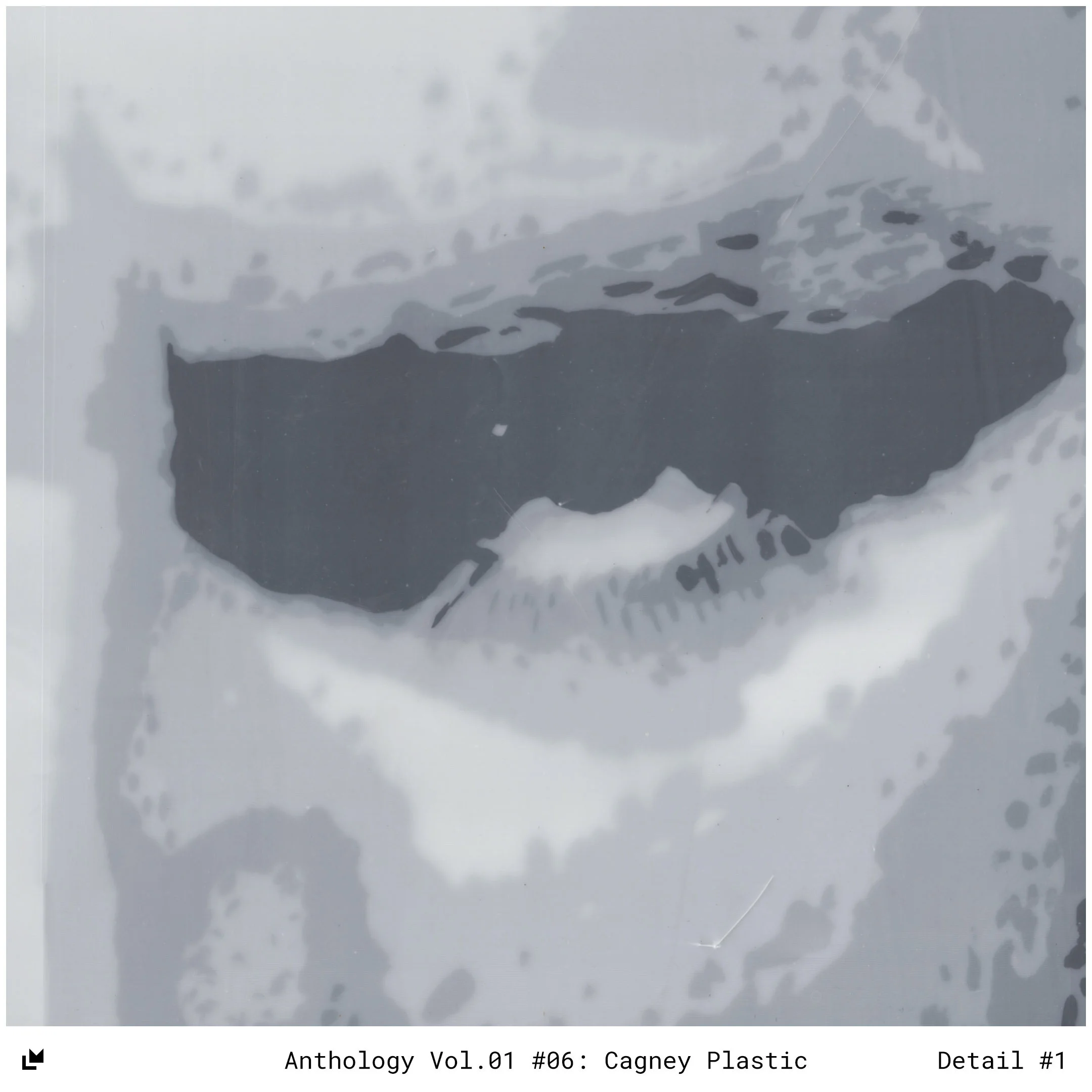
Paper or plastic?
I realized that plastic sheets, the kind you would use as drop cloth when painting, had similar transparent properties to paper, and could be used to construct a value system. The benefit of plastic is that it could be stretched over wooden bars the same way a canvas would be made, allowing for larger pieces and not requiring a frame with glass.
One of the reasons this is an improvement over The Modern Pose is the reduction in value steps, from 10 to 5. The breakdown of value steps via Photoshop posterization is still linear, and the layering is still exponential, but in only using 5 value steps, the lighter gray tones have a chance to show through. What this means is the difference between white and the lightest gray is as strong as the darkest tones, meaning the mid-tones of the value are what have the least definition. This, I think, is what suggests the old-fashioned black and white film noir quality.
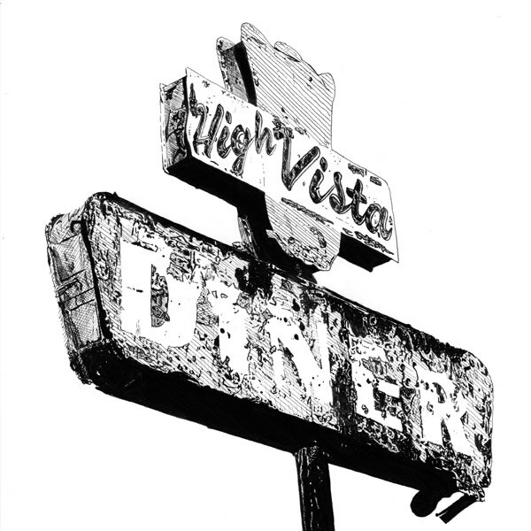
High Vista Diner
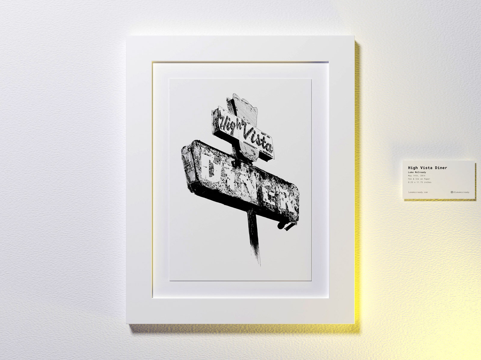
Title: High Vista Diner
Artist: Luke McCready
Date: May 14th, 2014
Medium: Pen & Ink on Paper
Size: 8.25 x 11.75 inches
Small beginnings
This fairly simple drawing was my attempt to return to art post-college. I had been working full time doing graphic design for a while and I missed doing art projects. I didn’t really know how to return to art just for myself and not for a class, so I just started small and returned to some pen techniques I had done earlier.
The reference image was a photo I found online, I’m not sure where (I keep a folder on my computer with hundreds of interesting photos I’ve collected over the years that might inspire future art). I saw it as a fun challenge to recreate the texture of it.


Degraded texture
The technique used here is pretty straightforward hatching and crosshatching with a very fine pen. I used a lot of solid black regions and outlining to create complex texture.
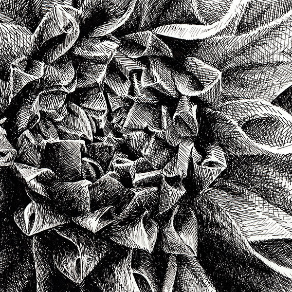
Flower Study

Title: Flower Study
Artist: Luke McCready
Date: May 23rd, 2014
Medium: Pen & Ink on Paper
Size: 10 x 8 inches
A Gift
This drawing came about as a gift for my grandmother’s birthday. She was a lover of flowers so I wanted to represent that in a drawing. She was very pleased to have it, being a fan of my art, and displayed it in her home. After her passing, I got it back and have it in my apartment.

Not your typical flower drawing
I’ve never liked flower drawings, so I wanted to make it stylistically different from the norm. I decided to go with a black and white close-up shot to make the floral nature slightly more ambiguous. The pen style is crosshatching with a lot of informal movements creating a bit of a chaotic texture.
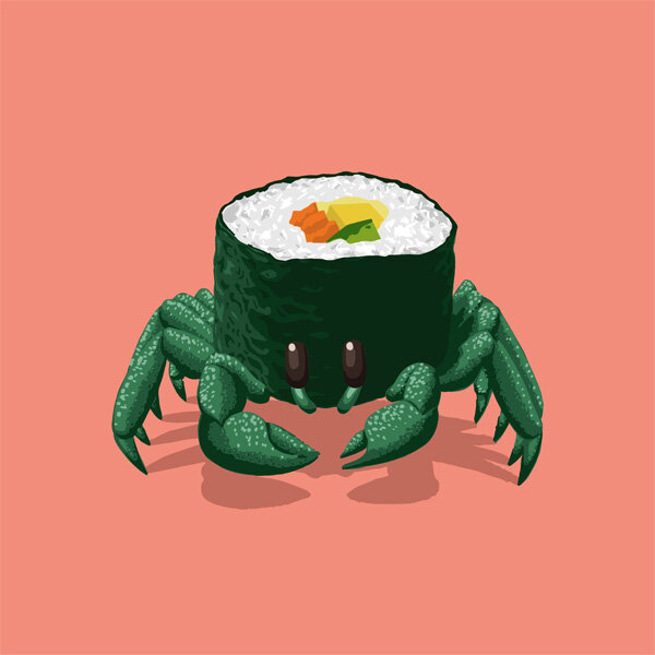
Sushi Crab

Title: Sushi Crab
Artist: Luke McCready
Date: August 23rd, 2015
Medium: Vector Illustration
Size: 1:1
Is that a crab? Is that sushi?
The story behind this rather odd-ball piece is fairly absurd. I was leaving work one summer day and saw a bit of debris on the sidewalk ahead of me. My first thought was that it was a crab. As I got closer I looked again and thought it was a piece of sushi on the ground. In actuality it was just a torn piece of nylon fabric, but I thought the mental jump from crab to sushi was unusual enough to inspire this drawing. I was looking for an opportunity to make some kind of vector illustration, as I didn’t have much experience in that medium and this was just the kind of project I was looking for.


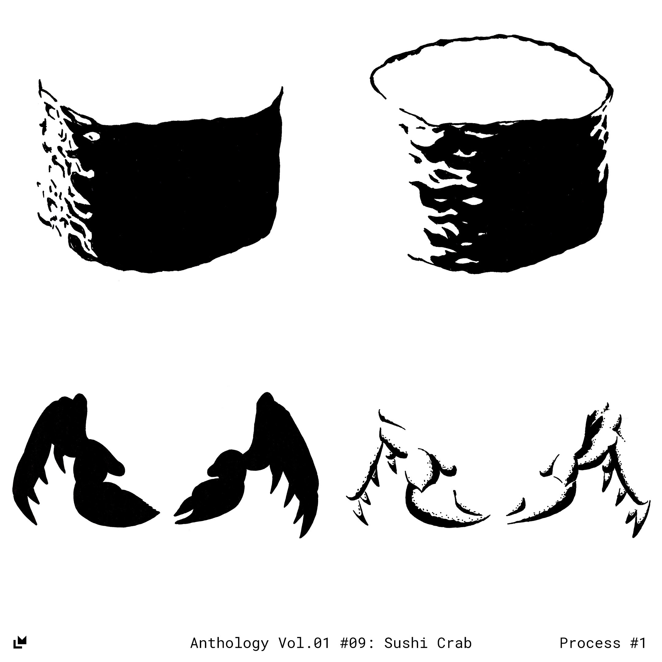
An unusual start
The actual process for making this is a bit unusual for a vector illustration. I didn’t have much experience with the medium so I started with what I knew, pen and paper. I did a pencil sketch as a base and used tracing paper and pen to make solid color blocks of the sections I would need. I then scanned each of these tracings and used image trace to convert them to a vector shape. I then overlayed these shapes and adjusted the color to what I wanted. This ended up being a neat look, the hand-drawn aspect coming through, which is uncommon for the vector world.
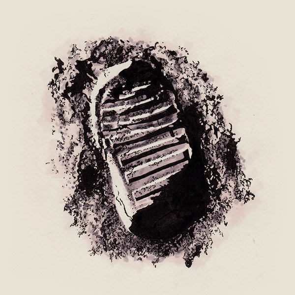
Lunar Footprint

Title: Lunar Footprint
Artist: Luke McCready
Date: January 29th, 2016
Medium: Grayscale Marker on Paper
Size: 8 x 8 inches
A quick experiment
The subject matter I chose was the classic Apollo 11 footprint photo. I’ve had a fascination with space in general, and the 1960’s space race era in particular so it’s an easy well to return to when looking for a black and white image.
I was looking for any relatively simple black and white image I could use for a small test image, as this was more of a medium practice than a nice finished piece.

Grayscale test
This drawing began mostly as a test image for experimenting with Prismacolor grayscale markers. I was curious about the workflow and end result. I wondered if it could have the permanence and clarity of pen and ink combined with the soft gradation of graphite. Ultimately, I would find this to be true, but in this image it stayed more graphic.