
Lines On My Face

This series was done over the summer and fall of 2011 while I was in college. I had taken some drawing and painting classes in school and was looking for an experimental and exploratory series to work on as a diversion over my summer.
I wanted to work with pen and ink, and use this series as an opportunity to grow my skill set with that medium. Each new drawing was an opportunity to try out different methods of producing an image, within a limited palette of only straight lines and dots (which I consider to be a very short line). Portraits are a great testbed to push the boundaries, you can distort or exaggerate quite a bit and the viewer’s eye will do a lot of the work for you, putting the image back together. All drawings in this series are done on quarter-inch lined graph paper. I chose that because I already had an 18”x24” pad on hand and it made the grid transfer technique easier, saving me the trouble of drawing a grid.
The specific subject matter was a mix of found images that inspired me, along with pictures of family and friends. The name was taken from the Peter Frampton song, I didn’t give it any more thought after that, and it stuck.
The overall theme here is essentially a rejection of photorealism. I was interested in how little I needed to rely on replicating an image with accuracy and still have a drawing that was recognizable.
Table of Contents
Worship

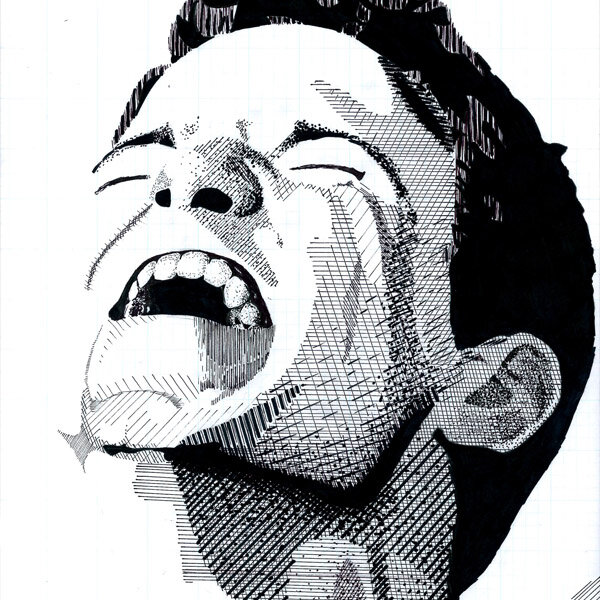
Title: Worship
Artist: Luke McCready
Date: June 20th, 2011
Medium: Pen & Ink
Size: 12 x 16 inches
Singled out from the crowd
The source image for this drawing came from an online image search for “worship”. I singled out an individual in a crowded audience of a worship concert and found the image really interesting. There’s a nuanced mix of emotions here and I find that people read it differently.
I’d worked with this image before in the spring, doing a 1 color vector illustration of it. It’s common for me to find an image I gravitate towards, I end up experimenting with it in different ways over months.

Just the basics
The techniques here are pretty basic. There isn’t a lot of smooth gradation, values are broken out into clearly delineated zones. There’s a hodgepodge of hatching, crosshatching, and stippling with a variety of pen sizes.
Areas like the shirtsleeve and the hair show how simplified shapes and abstracted patterns are still able to communicate the desired form. This would carry through the rest of the series and be expanded upon in different ways.
Goofing Off

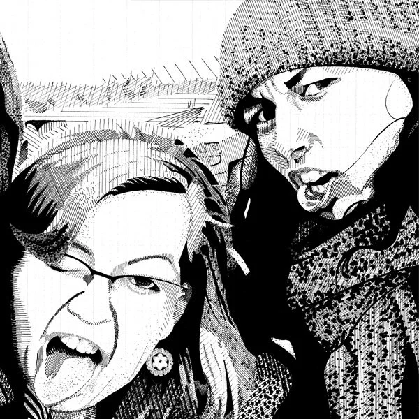
Title: Goofing Off
Artist: Luke McCready
Date: June 27th, 2011
Medium: Pen & Ink on Paper
Size: 20 x 13.5 inches
Youthful energy
The source image for this drawing was a photo of my friends taken the previous winter on our college youth group coast retreat. I really love the personality and free-spirited exuberance. It really speaks to the time of life that I and my friends were in here.
The image represents an added challenge of doing three portraits in one.

As far as technique, there isn’t much evolution over the previous drawing in the series. Values are coarsely chunked up into zones without much gradation and there’s a mix of techniques and pen sizes. The complexity of the mouth of the right side portrait is my favorite part of this piece.
Humphrey Bogart in a Dark Alley
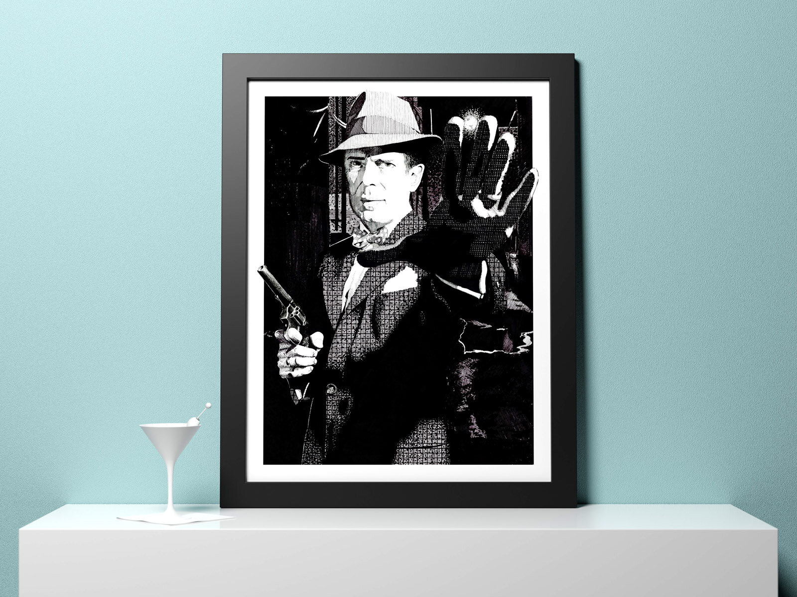
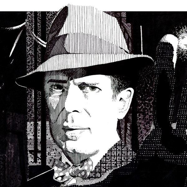
Title: Humphrey Bogart in a Dark Alley
Artist: Luke McCready
Date: July 6th, 2011
Medium: Pen & Ink on Paper
Size: 18 x 24 inches
A film noir atmosphere
This is one of my favorite drawings in this series, it’s based on a really cool image of Humphrey Bogart that I found online. I filed it away as a great drawing reference and looked for a chance to use it. The original image had a neutral gray background, i wanted something more interesting and more indicative of the film noir roots of the image so I added a darkened back alley background.
The frame-breaking border was done in Photoshop well after the drawing was finished when this piece was being set up to have 18”x24” prints made.


An evolution
This piece represents an evolution of the techniques used in this series. There’s a similar mix of hatching and stippling with a variety of pen sizes, but with more nuance and detail, especially in the face. I also started assigning techniques and patterns to represent materials, like the grid of the suit coat.
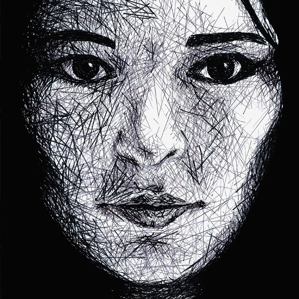
Dissolving Self-Portrait (Homage to Chuck Close)

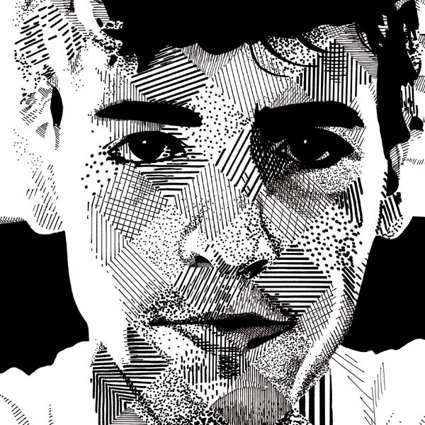
Title: Dissolving Self-Portrait (Homage to Chuck Close)
Artist: Luke McCready
Date: August 3rd, 2011
Medium: Pen & Ink on Paper
Size: 12 x 18 inches
Turning point
This piece was the turning point of this series, I challenged myself to explore a wider variety of techniques in a unique and graphic way.
The reference image was a photo I took of myself (this was pre-selfie) in an extremely casual, almost accidental way. The lighting in the room just happened to be awesome and it made a great picture.

A patchwork quilt
I was inspired by the artist Chuck Close, particularly the way he used a multitude of abstract and graphic shapes that added up to make something photo-realistic. Close worked with color so I had the challenge of translating the general idea to black and white.
The diagonal grid was an important part of translating Close’s look, I used each diamond shape to explore different techniques. My thinking was that this would create a wild, patchwork texture up close, but from a distance the actual values would optically resolve and create a cohesive image.
I wanted to use as much variety as possible. Some diamonds use more complex variations, others are very simplified to only hatching or dots. I also used a variety of pen sizes.
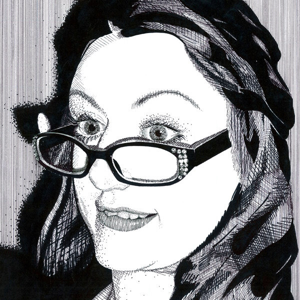
Valerie, the Scholar
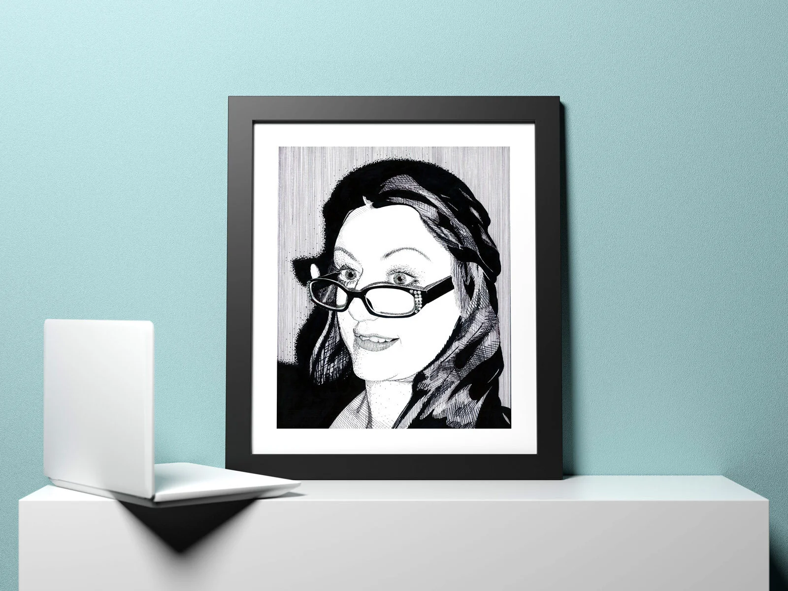
Title: Valerie, the Scholar
Artist: Luke McCready
Date: August 18th, 2011
Medium: Pen & Ink on Paper
Size: 14 x 17 inches
Bright light, dark room
This is a photo of my sister that she took. The lighting was initially a heavy flash, but I reinterpreted that as a bright computer screen in a dark room. Combine that with the glasses, and that’s where the name came from.


Vertical Lines
The standout technique to me here is the background shading, done entirely with thin and close vertical lines. I also enjoy the shadow of the hair on the left, which uses large dots to soften the edge. The contrast between these two techniques here is interesting to me.
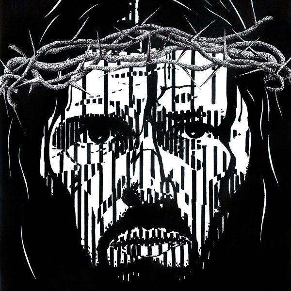
The Good One

Title: The Good One
Artist: Luke McCready
Date: August 31st, 2011
Medium: Pen & Ink on Paper
Size: 15 x 20 inches
Modernizing a classic subject
Depictions of Jesus Christ in art were common throughout the renaissance and other eras, and as such have a very antique feeling. I thought he could use a modern interpretation. I chose the most extreme simplification of technique used so far, resulting in a very graphic end result.
I struggled to find a decent photo reference to work from, looking at historical art as well as accurate reconstructions of what Jesus’ face would have been. I was ultimately unsatisfied with these, mostly because of the expression. I ultimately used a photo of Jim Caviezel for my reference. Although he played Jesus in The Passion of the Christ, I didn’t use a still from that film, but from something else.

His stripes
The technique used here is only thick vertical lines. The lines have a uniform thickness across the entire piece, so to create a variety of tones, I varied the space between them. The image was divided up into zones of value, using differing line spacing within these zones. I cheated slightly. I decided that areas that were to be pure black could be made into any solid shape, meaning there are organic shapes sprinkled in among the heavy stripe effect.
To offset the crown from the rest of the portrait, I used stippling with a very fine point pen.
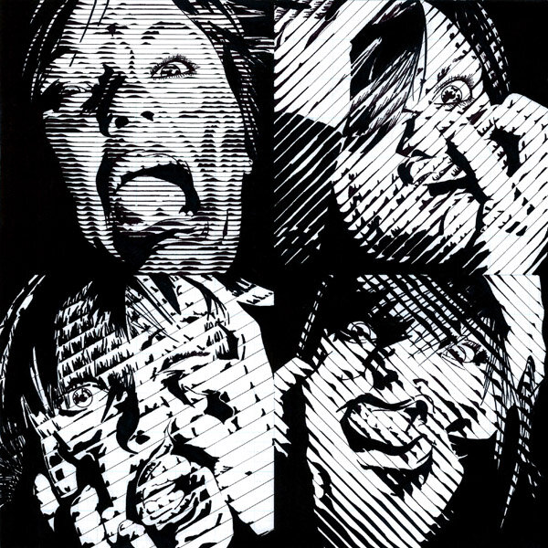
Sharon x 6

Title: Sharon x 6
Artist: Luke McCready
Date: September 21st, 2011
Medium: Pen & Ink on Paper
Size: 14 x 21 inches
Experimental madness
Here’s where the series starts to really go wild. Based on the success of the last drawing, I wanted to push things even further and experiment even more.
The photo references used were from my friend Sharon who took these amazing self-portraits with all kinds of facial expressions. She encouraged me to use them and I was happy to do so. They already had a dark, edgy quality and I wanted to pick an art style that added to that. The decision to do 6 was initially because I couldn’t pick just one, but it turned out to be a great idea because they told a little bit of a story and served as an opportunity to test some variations on technique.


Lines reinvented
My previous drawing featured a constant line thickness with varied spacing to achieve the desired value. This drawing is basically the opposite, lines are evenly spaced, and the thickness of the line changes on one side to achieve the desired value.
Each indivudal portrait uses 1 of 3 different line spacings: close, medium and wide, matching the portrait opposite it in the overall drawing. I also used different angles of lines: horizontal, vertical, 30, 60, and 45 degrees, with each portrait being a 90 degree turn of the one opposite.
The technique in this drawing has varying levels of success. The close-set lines worked the best, it gave the image effectively a higher resolution. The wide-set example was so far apart it forced me to cheat quite a bit, which makes those images weaker in my opinion.
This technique is one that I revisit in the future.
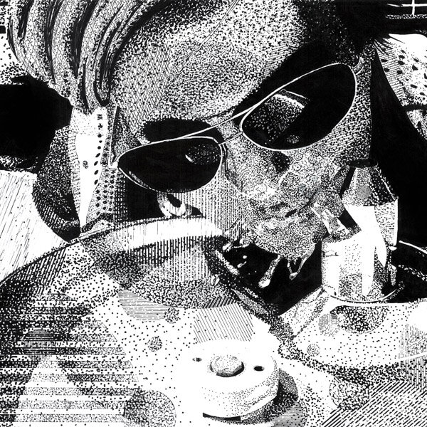
Superstippling: A Drink (Image vs. Surface)
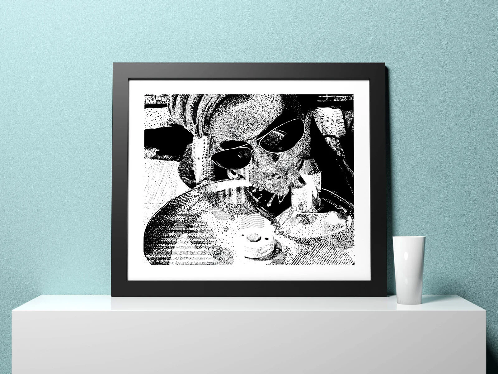
Title: Superstippling: A Drink (Image vs. Surface)
Artist: Luke McCready
Date: September 28th, 2011
Medium: Pen & Ink, Whiteout on Paper
Size:16.25 x 20 inches
A mix of textures
The reference photo here is one that came from a photoshoot I did with my friends in and around downtown Bend, OR. I chose this picture of Savannah because I liked the variety of textures like the metal of the drinking fountain and the water droplets.
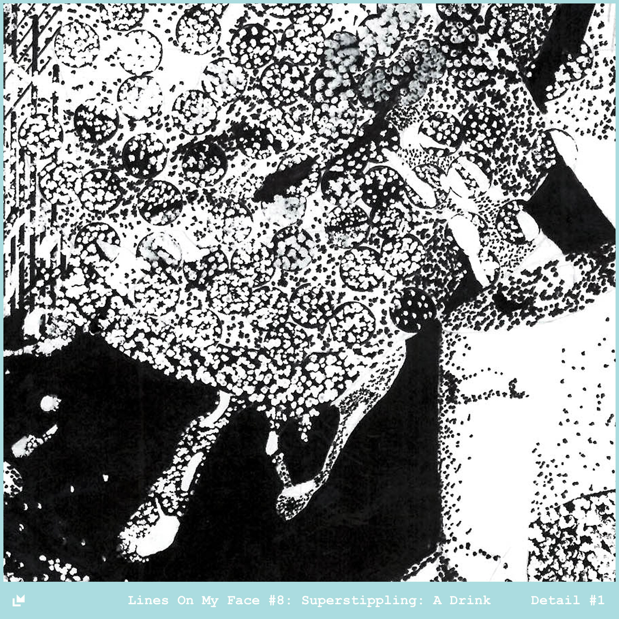

Breaking the mold
Superstippling is a term I invented to describe the new technique here. I started the drawing by applying an abstract field of circles filled in solid black, or with thick lines. I wanted to start with a blown-up field of the very elements that I’d end up building the image out of. When it came to actually draw the image, I was forced to use white-out over the dark parts and pen over white to get to the desired tone.
The result is an image that feels fairly sedate from a distance, but up close the true state of the surface becomes known. This near-far relationship is something I would I would utilize in different ways throughout the future of my art.
Kayla and the Briar Patch

Title: Kayla and the Briar Patch
Artist: Luke McCready
Date: October 3rd, 2011
Medium: Pen & Ink on Paper
Size: 13.5 x 17.75 inches
The end
The reference photo used here came from my friend Kayla, I really liked the lighting in it and was happy to use it in a drawing. The title is in reference to the drawing technique used here.
This is the final drawing of the series. I was pleased with earlier experimentation and exploration and was glad to wind things down with this drawing.

‘Briar Patch’ technique
This technique is a lot closer to more traditional drawing compared to previous drawings in the series. Nevertheless, it fit my series and I wanted to try it. Straight lines at random angles are slowly built up to create tone. With a great deal of patience an artist could use this to create really smooth gradations and add a lot of detail.
Unfortunately I wasn’t all that patient, I ended up rushing this drawing to completion, the change to a thicker pen is evidence of this. Overall I felt that I had done all the exploration I wanted to do in this series and I was ready to move on to other things.