
The Greatest Adventure

“The Greatest Adventure” is an original art series commemorating the 50th anniversary of the Apollo 11 moon landing on July 20th, 1969. The series is inspired by the historical events of the space race, starting with the breaking of the sound barrier, through cold war paranoia and competition between the United States and the Soviet Union, and culminating in Neil Armstrong's famous “small step”. The art series is presented in 3 acts, each with a large central oil painting representing an important engineering achievement, along with drawings depicting important historical figures and events. The black and white drawings were done with grayscale markers and India ink. They feature a motif of interaction between the subject and the frame that represent breaking through barriers. The color drawings were done with dots of 4 markers approximating the CMYK print process and feature a motif of stars, each specific to the historical figure being depicted.
Musical accompaniment is the 2015 album “The Race for Space” by Public Service Broadcasting.
This series in it’s entirety was on display at The Evergreen Aviation & Space Museum from July to December 2019.
Table of Contents
The Barrier

Title: The Barrier
Artist: Luke McCready
Date: April 27th, 2019
Medium: Grayscale Marker on Paper
Size: 24 x 36 inches
Breaking barriers
When I initially mapped out this overall series, I wasn’t quite sure exactly where to start it in the history of the space race. This first piece went through a number of iterations before I settled on what I wanted to do, which is why it’s one of the last ones completed. As part of my research for this series I watched the 1983 film The Right Stuff. It opens with Chuck Yeager breaking the sound barrier and presents him as a sort of proto-astronaut, which I found interesting. It also plays perfectly into the theme of these 6 black and white drawings, breaking barriers, so I set that as my beginning.


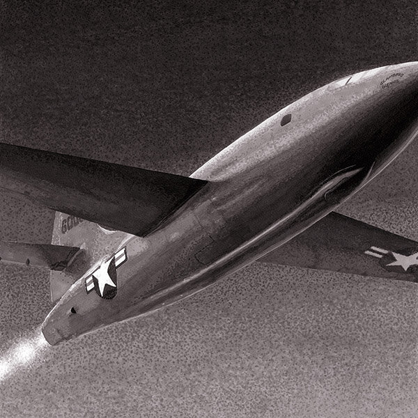
The Bell X-1
These black and white drawings in the series all feature a thick white border that certain parts of the image come in front of, creating a 3D effect. Not only is this a cool graphic feature that sets these drawings apart from a more generic black and white photo from the time, it also plays into the theme of breaking barriers. Each of these black and white drawings represents a significant milestone in aerospace history, this one being the breaking of the sound barrier in 1947.
The actual reference photo is a Photoshop fabrication I did using a number of references. The main source was a shot of the Bell X-1 in a museum, but it was taken from the wrong angle. I wanted this image to move left to right so I had to mirror that image and then un-mirror all of the text on the plane. The gradient sky background and the exhaust are also fabrications based on other reference photos.
The gradient background proved to be a challenge to get right. These black and white drawings are done using the white paper, 10 grayscale markers, and ink to create 12 areas of tone; dots can be applied to further blend the boundaries between them. This sounds straightforward in principle but in practice it was tricky to find the right balance and make the gradation as smooth as possible. I used the posterize feature in Photoshop to create 12 clear areas of value so i could more easily know what shade to place where. This results in crisp lines between value zones, which is fine for a high-detail area, but for smooth forms is difficult.
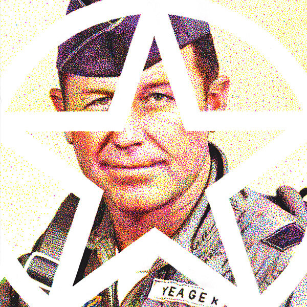
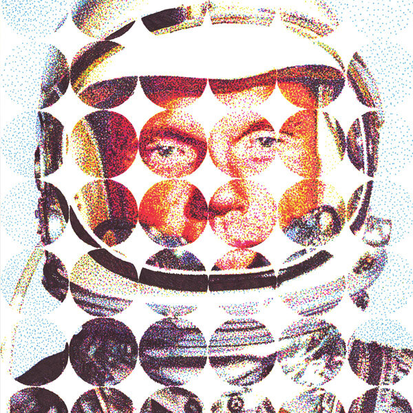
Yeager

Title: Yeager
Artist: Luke McCready
Date: March 12th, 2019
Medium: 4-Color Prismacolor Marker on Paper
Size: 18 x 24 inches
A proto-astronaut
The first of the 6 portraits in this series is of Chuck Yeager, the pilot of the Bell X1, the first person to break the sound barrier. I wanted these portraits to focus on individuals who were important to the overall story of the space race. I could have started in a number of different places, but I chose Chuck Yeager as it’s a major milestone in Aerospace history, and he’s sort of a proto-astronaut in attitude and accomplishment.
Each of these 6 portraits is unified by a graphical star motif, the one used here is based on the United States Air Force logo of the time.


A proto-astronaut
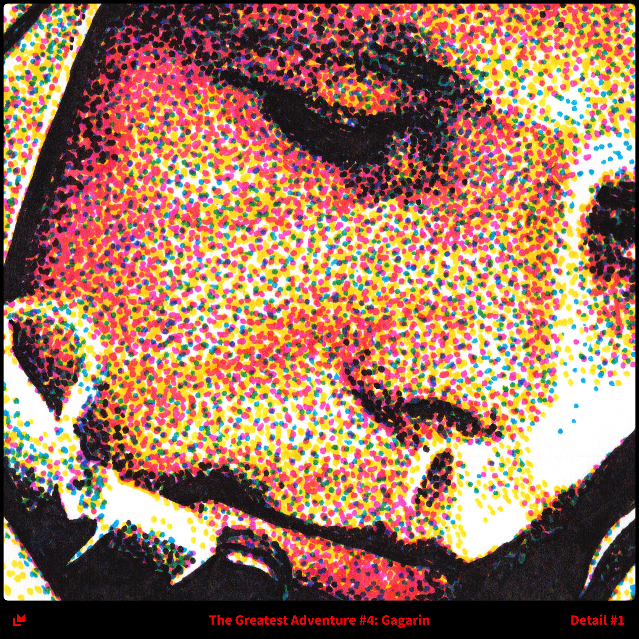
Stippling is a an old drawing technique whereby an artist applies dots to a page. By increasing the density of dots, a darker tone can be achieved, allowing for the creation of a black and white image. Photo printing on paper also creates an image in a similar way, only with a grid of dots that are made larger or smaller to create tone. Printed color photos are done using the same process, only repeated 4 times. By adjusting the ratios of Cyan, Magenta, Yellow and Key (black) inks, any range of colors can be produced and a lifelike image results.
For this portrait, and the others in this series, I combined the artistic discipline of stippling with the color theory of photo printing to produce a full-color image by hand using dots. to start, I open my image in photoshop and view each CMYK channel individually, starting with yellow. This gives me an image of what the density of yellow ink should be on my page to achieve the best results in the end. I match that as best I can with dots, and move on to magenta, then cyan, then black ink. I have no way of knowing for sure if the image will turn out except at the end, so I have to just trust the process.
I used Prismacolor markers for these drawings. Through some testing I found that Copenhagen Blue PM-40, Rhodamine PM-55, Canary Yellow PB-19, and Black PM-98 gave the closest approximations to true CMYK ink. They aren’t exact though, which means the final color quality will end up being tinted slightly in a certain direction (I find these drawings come out a bit warmer than expected). Also, on a normal printed photo the dots would be too small to see, resulting in a really smooth image. But the pen dots are quite a bit larger and so are very visible. I like this as an artistic choice, it means when standing far away the dots blur and the image is smooth, but up close the reality of the image construction is plainly visible. This close-far relationship is something I enjoy using in all of my art.
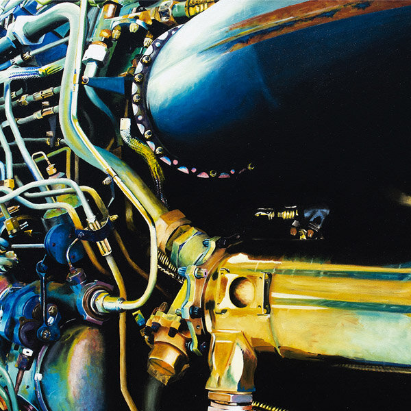
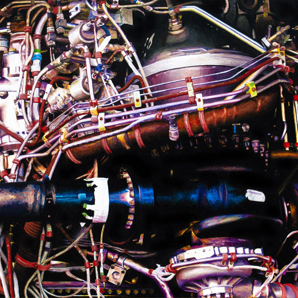
SR-71

Title: SR-71
Artist: Luke McCready
Date: May 5th, 2010
Medium: Oil Paint on Canvas
Size: 56 x 42 inches
The ultimate spy plane
This painting, along with a couple of other pieces were preexisting when I decided to make The Greatest Adventure series. In fact, the inspiration for the series came from the necessity of tying together these works into a cohesive narrative to make them feel at home.
I chose to put SR-71 here in the series because it represents the espionage and hostility between the Soviet Union and the USA. The SR-71 was the ultimate spy plane. The cold war competition between the two world superpowers played out in dramatic fashion in the story of the space race, but it was underpinned by very serious geopolitical issues. Putting satellites and humans in space is a wonderful achievement for mankind, but it has pretty obvious military implications. In this opening act of the story, we’re setting up the motivations of the various actors.


Phthalo blue
The reference image for this painting is a photo I took myself on a visit to the Evergreen Aviation & Space Museum in 2008. In fact, the blue shape in the bottom right corner is my reflection. I took a lot of pictures that day but I always came back to this one as a future reference image because of it’s high detail and complexity. It’s an image of a portion of the engine of the SR-71 Blackbird that’s on display (one of the coolest planes of all time).
In the fall of 2009 I took a painting 2 class in college and chose to do this for my project. This is only my third oil paint canvas I had ever done, and it seemed perhaps too ambitious, especially given the large size. But my teacher (the inspirational Bill Hoppe) had faith in me and allowed me to work on this for many months until it was finally completed in May of the next year.
There was a lot of learning and sections were repainted several times, but it came out really well in the end. I often end up disappointed with most of my art because I see the flaws that come along the way, but this is one of the few that I have always loved, I wouldn’t change anything.
The original image doesn’t look much like the final painting because part of the prep for this involved upping the contrast and saturation to an extreme degree using Photoshop. This brought out a ton of color from an otherwise grayish image, and the process of painting it added even more. The result is something photo-real but also unnatural in an interesting way.
I used a grid transfer to get the proportions right, even using a finer grid a second time on the left side to make sure everything was accurate. I used a fairly limited palette of paint, focusing mostly on the yellow, green, and blue. I used Phthalo blue quite extensively, it’s a difficult color to mix with as it’s so potent so it stands on it’s own quite a lot. It’s the signature color here. The process of painting was quite difficult as the image is so overwhelming in complexity, so to help with that I blocked off a small area, maybe 12x12 inches, and only painted in that for a session. This made it much easier to focus and make slow, measured progress.
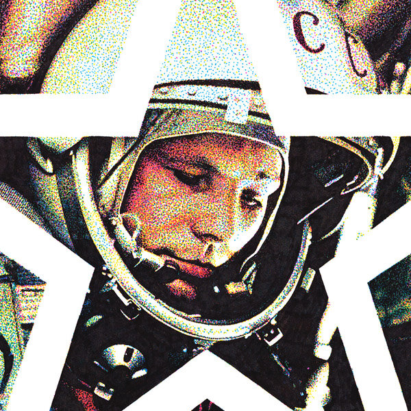
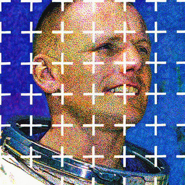
Gagarin

Title: Gagarin
Artist: Luke McCready
Date: September 29th, 2018
Medium: 4-Color
Prismacolor Marker on Paper
Size: 18 x 24 inches
The first man in space
The early achievements in space are all owned by the Soviet Union, so including Yuri Gagarin here serves to make that point. He was not only the first human in space but also the first human to orbit the earth, breaking both barriers at once, and getting there just ahead of the American space program, which was stuck playing catch-up through all of the late 50’s and early 60s.
The star motif continues, this time with a star shape taken from the USSR flag.


The progression of layers
The technique used here is the same as the previous drawing of Chuck Yeager. The image is separated into it’s primary color components, and these are applied one at a time by hand with dots. Yellow, Magenta, Cyan and Blue markers are used, in that, order to achieve the final image. Once again I use Photoshop to view each one in isolation.
I did the entire drawing completely in each color before moving on to the next, which isn’t necessary, but I did it that way so I could document each step to clearly show the progression of layers.
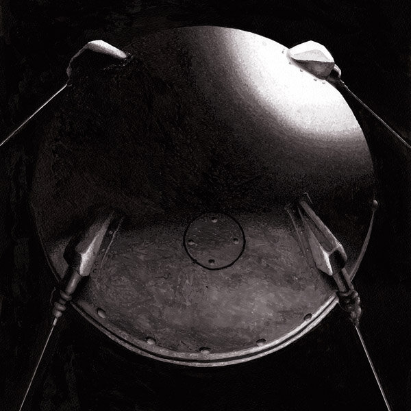
The Satellite

Title: The Satellite
Artist: Luke McCready
Date: February 18th, 2019
Medium: Grayscale Marker on Paper
Size: 24 x 36 inches
Looming large
Sputnik I was the first artificial satellite put into space. Launched in 1957 by the Soviet Union, it kicked the space race off properly, with the US launching their first satellite a few months later. I represented Sputnik here looming large over the earth, suggesting the ominous nature of the achievement and it’s contribution to cold war tensions.


A digital composite
The drawing process started with researching reference photos. I knew the image I wanted to make, but finding the right angles and lighting was difficult. I ended up making a composite in Photoshop. The earth was an easy one, but Sputnik was mostly a custom digital drawing.
Once I had my final image in Photoshop, I could then follow my usual technique of posterizing to 12 levels and using that as my drawing reference for the grayscale markers.
If I were to do this over, I would use a 3D model of sputnik and create a render. I would have had much more control over lighting and angle and would have produced a more realistic result. I used this technique for a future drawing in this series, but I didn’t have that skill in my toolbox at this time.
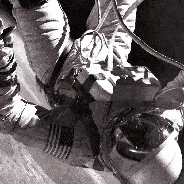
The Space Walk

Title: The Space Walk
Artist: Luke McCready
Date: November 3rd, 2018
Medium: Grayscale Marker on Paper
Size: 24 x 36 inches
The comeback
This piece is the beginning of act 2 of this series. This section represents the American comeback in the space race and their answer to the Soviets. This image is of Ed White performing the first US space walk in 1965. I’ve always loved the original photograph, the pose and tubing strongly suggest weightlessness. The theme of these black and white drawings is breaking barriers, represented by elements coming out past the large white border. I find this instance of that idea particularly pleasing.


A sense of weightlessness
The process for creating this drawing is the same as the other black and white drawings, beginning with Photoshop. The original image that NASA produced is extremely high resolution, which helps a lot. I set up all of the 3D effects in Photoshop, turning the image, painting out sections, adjusting levels in black and white, etc. My working document is actually the same size as the final drawing at 300 dpi, which helps with post-processing as I can use the same document to set up prints.
I use posterize to break up the values of the image into 12 zones, which correspond to the grayscale markers I use. The level of detail on this image lends itself well to this process as those boundary lines are less noticeable. I use dots to smooth out certain transitions, which I like the look of, it feels like film grain.
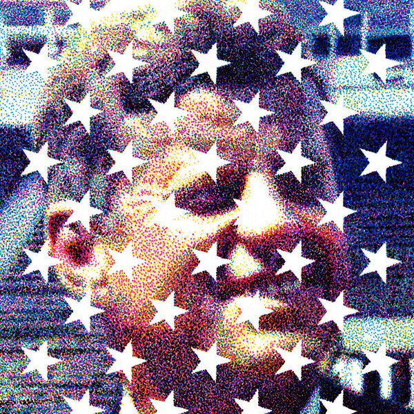
Kennedy

Title: Kennedy
Artist: Luke McCready
Date: August 15th, 2018
Medium: 4-Color Prismacolor Marker on Paper
Size: 18" x 24 inches
America’s answer
A pivotal moment in the US side of the space race was President John F. Kennedy’s famous “moon” speech in 1962. This crystallized the ultimate goal of landing on the moon before the end of the decade, an extremely ambitious goal. This drawing depicts Kennedy giving that very speech. As usual with these portraits, there’s a graphical motif of stars. This one features the American flag hung vertically with all 50 stars present, and the suggestion of some of the stripes.


A certain exactness
As always with these drawings, I made an actual size digital mockup in Photoshop. This proved to be especially helpful with the stars as they require a certain exactness. I printed out a section of them at actual size so I could trace them onto the drawing, ensuring accuracy. Everything else was done through a grid transfer. In the same process as the other portraits, I did the entire drawing in yellow, using the yellow channel in my CMYK photoshop mockup as a reference. I then repeated with magenta, cyan, and black.
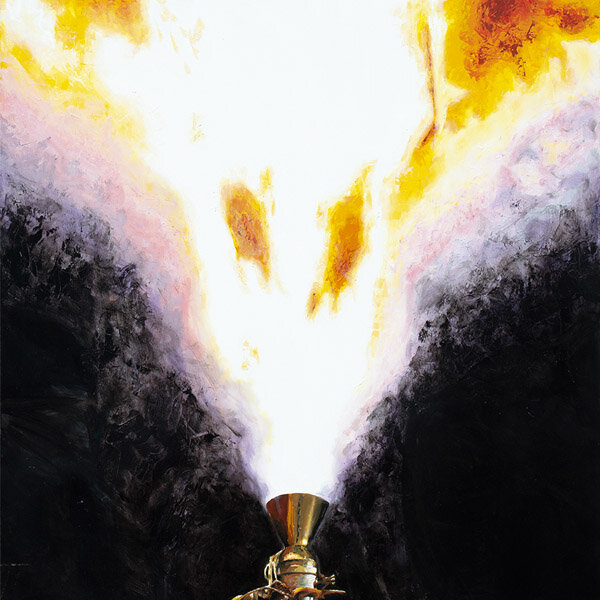
Rocket Test

Title: Rocket Test
Artist: Luke McCready
Date: May 23rd, 2013
Medium: Oil on Canvas
Size: 48 x 60 inches
A one-off
This painting doesn’t represent a specific moment in history, but rather the general idea of testing and preparing the machinery that get’s us into space. This painting is the mid-point of the entire series, and is the most-one off. Every other work is part of a set, or at least a pair, but this one is unique. It’s also the most expressive and the least technical of all the pieces in this series.


There’s no up or down in space
This is another piece that I had made before I started work on this series properly. I had made this during my senior year of college, the canvas was actually donated to me by my professor. The whole painting came together pretty quickly, which is surprising considering how large it is.
A common comment I hear from people about this painting is that it’s upside down. To that, I give my tongue in cheek reply that there’s no up or down in space. In reality, it’s because this is actually a top-down view of a horizontal engine firing, so the orientation of the image doesn’t matter. I chose to put it turned this way just because it felt right. The reference photo itself is one I found online of a NASA rocket test, and I adjusted the contrast and color in Photoshop.
The painting style is unusual for me, I don’t normally paint with such a loose technique using a palette knife but it works here to represent the fire. My favorite part is the engine itself, the color use is so surprising, using browns, golds, and even green, but it works.
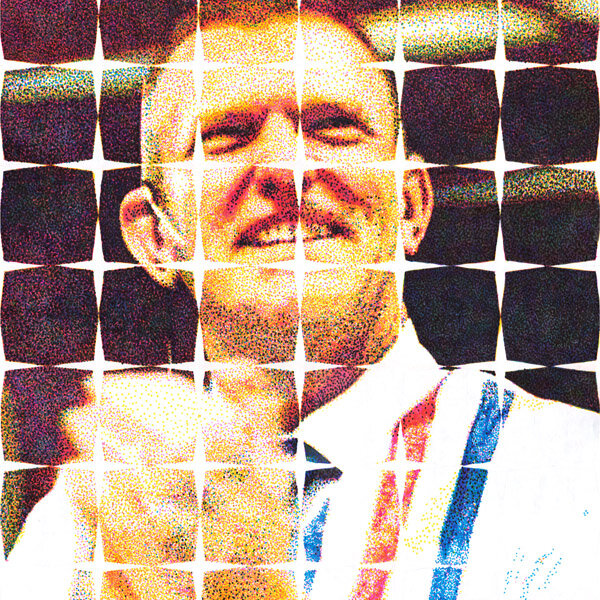
Glenn

Title: Glenn
Artist: Luke McCready
Date: October 24th, 2015
Medium: 4-Color Prismacolor Marker on Paper
Size: 18 x 24 inches
An iconic image
Continuing with the theme of the second act, America’s space program catching up, we have an image of John Glenn, the first American to orbit the earth. The reference image here was and is an iconic one, that’s come to represent this era of space exploration. This was the first of these portraits to be done and so introduces the formula of the image, utilizing the graphic overlay. The graphic pattern used here is a simple series of circles that represent the idea of an orbit. The negative space creates an interesting 4-point star that feels like it belongs in the 60s-era of design.


A robust test
This drawing is another that was done as a one-off before the idea for the whole series came to be. It started as primarily a test image for this new technique I was experimenting with utilizing 4-color stippling to create a manual half-tone dot image. Part of the reasoning behind choosing this image was because I felt that a skin tone and the shiny metallic texture of the suit would be a really robust test. Overall, the system performed really well and I was very pleased with the result. I knew as soon as I finished that I would want to do more drawings like this.
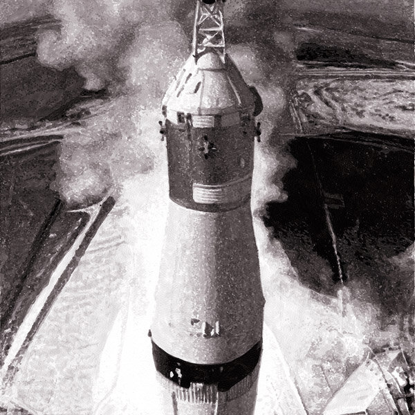
The Liftoff

Title: The Liftoff
Artist: Luke McCready
Date: May 26th, 2019
Medium: Grayscale Marker on Paper
Size: 24 x 36 inches
Leaving earth
The final image for act two is the perfect setup for act three, all about the moon exploration. The reference image used here is very well known and recognizable, I gave it a little twist having the tip of the rocket come out of the frame, symbolizing the crossing of the barrier between earth and space.


An interesting contrast
This image continues to use the same grayscale marker technique I’ve used previously. My reference image is divided into 12 regions of value in Photoshop to serve as a guide. This image was especially difficult as the scaffolding had a lot of tiny areas with a surprising amount of dynamic range I hadn’t considered. I found it to be an interesting contrast to rendering the smoke which was very free-form and forgiving.
The Orbit

Title: The Orbit
Artist: Luke McCready
Date: June 15th, 2019
Medium: Grayscale Marker on Paper
Size: 24 x 36 inches
A breakneck pace
Act three is all about the final push to the moon, so it’s fitting to open it with a scene from Apollo 8, the first manned orbit of the moon. This mission was conducted in December of 1968, and by this time America had caught up to and surpassed the Soviet Union in space achievements.
One thing I’m always struck by is the breakneck pace of missions and accomplishments during this part of the space race. Getting to that moon landing is done through methodical steps, but they happen so quickly compared to space travel today. Between December of 1968 and July 1969 there were 4 Apollo missions with significant achievements happening in each of them.


3D was key
This work of art features my first attempt at using 3D modelling to create a reference image. I had sketched out my idea for this image but couldn’t find any references that would work exactly. photos of the earth and moon were easy to find, but the exact space capsule in the right lighting and orientation was impossible. I purchased a 3D model of the Apollo CSM online and used Blender to position and light it just how I wanted. This rendered image could be Photoshopped into my composition. This technique was a game changer and really made this piece a success. 3D would continue to be a tool I develop and use in future work after this series, eventually creating more complex environments.
Kranz

Title: Kranz
Artist: Luke McCready
Date: February 18th, 2018
Medium: 4-Color Prismacolor Marker on Paper
Size: 18 x 24 inches
The people on the ground
It’s easy to celebrate the astronauts that went to space for their courage in breaking into the unknown, and rightly so, but I also wanted to put a spotlight on the multitude of people on the ground who made it happen. I chose to depict Apollo flight director Gene Kranz as one of my six portraits as a representation of this group of people.
As usual with these 4-color portrait drawings, there’s a graphic star motif, this one inspired by the star design of the NASA logo.


The right image
I had a hard time finding the right reference image here, something from the right point in history, the right angle, and the right resolution. I think the one I chose is probably the best option.
The process for this drawing is the same as the previous portrait drawings. In Photoshop, I separate the CMYK channels and use each individually as a reference to draw from with the corresponding marker.
I used a grid to transfer the image, and had to draw it and the stars before starting. This pencil grid can be erased after the drawing is done.
Saturn V

Title: Saturn V
Artist: Luke McCready
Date: July 6th, 2018
Medium: Oil on Canvas
Size: 56 x 42 inches
A really big rocket
After the success of my previous painting, SR-71, I knew I wanted to do another one like it. This is the sequel, it’s the same size, and features the same subject matter of engine parts, only this time a portion of a Saturn V rocket engine.
This anchors it well with the third act of the series, as the Saturn V was the rocket used for the Apollo missions, and to this day remains the tallest, heaviest, and most powerful rocket ever brought to operation.


Opened palette
Unlike SR-71, which was based on a photo I took, the reference image for this was taken from online. It was modified in the same way to get the same effect, contrast and saturation were turned up to extreme levels in Photoshop.
Compostionally, I wanted to create an area of lower complexity and use that as a focal point that other more complex areas could point to in order to create some flow.
In order to better complement SR-71 I wanted to explore the other side of the color wheel. Instead of blue, green, and yellow, I went with red and purple as the main colors. This time however, I opened up my palette a bit more and created more browns and other less primary colors which help give it richness. I also couldn’t help but include some Phthalo blue to tie back into SR-71.
I worked on this painting off and on for over a year and spent at least 200 hours with it. For this, and other art in the series, I got up at 5:30 every morning to work on this before going to my day job. I did that for quite a few months in order to finish all of this on time. Overall this is probably my favorite painting that I’ve done, it turned out better than I could have hoped.
Armstrong

Title: Armstrong Artist:
Luke McCready
Date: June 28th, 2019
Medium: 4-Color Prismacolor Marker on Paper
Size: 18 x 24 inches
A mythic figure
Given that Neil Armstrong was the first man on the moon, it should be no surprise that he occupies the final portrait spot. His personal achievements in landing on the moon are great, and well publicized, so I won’t go on about them here. He’s become a bit of a mythic figure, representing an achievement larger than himself, which is natural for major events like landing on the moon. For Neil, this isn’t entirely undeserved.
Every portrait has a graphical overlay suggesting a star motif, and this one is no exception. The idea of this one is to play off of the Réseau plate, a plate of glass with crosshatches on it placed in a camera to provide reference and aid in measurements. It was used for scientific purposes, most famously on the Apollo moon missions (which is why photos from the moon’s surface have this artifact).
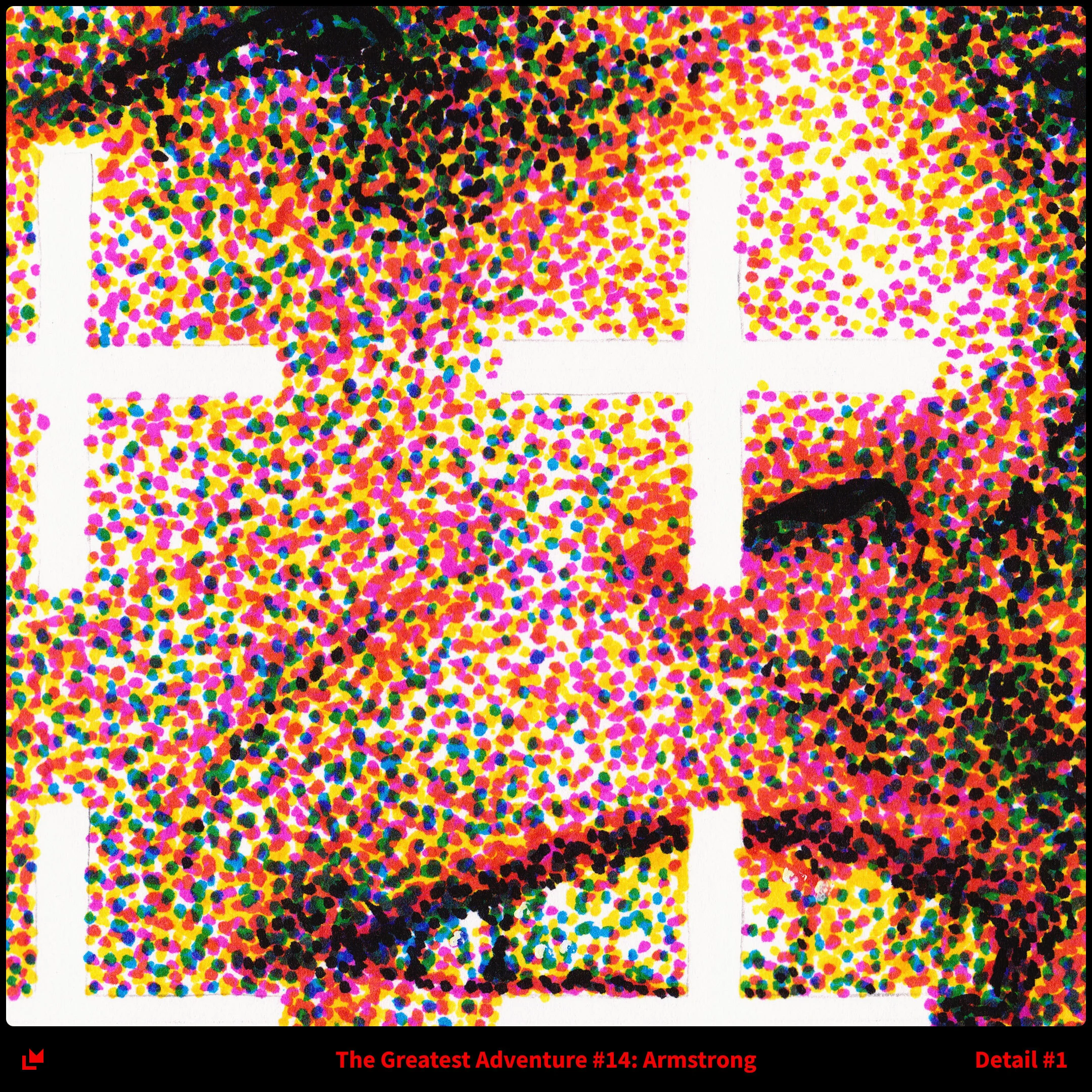

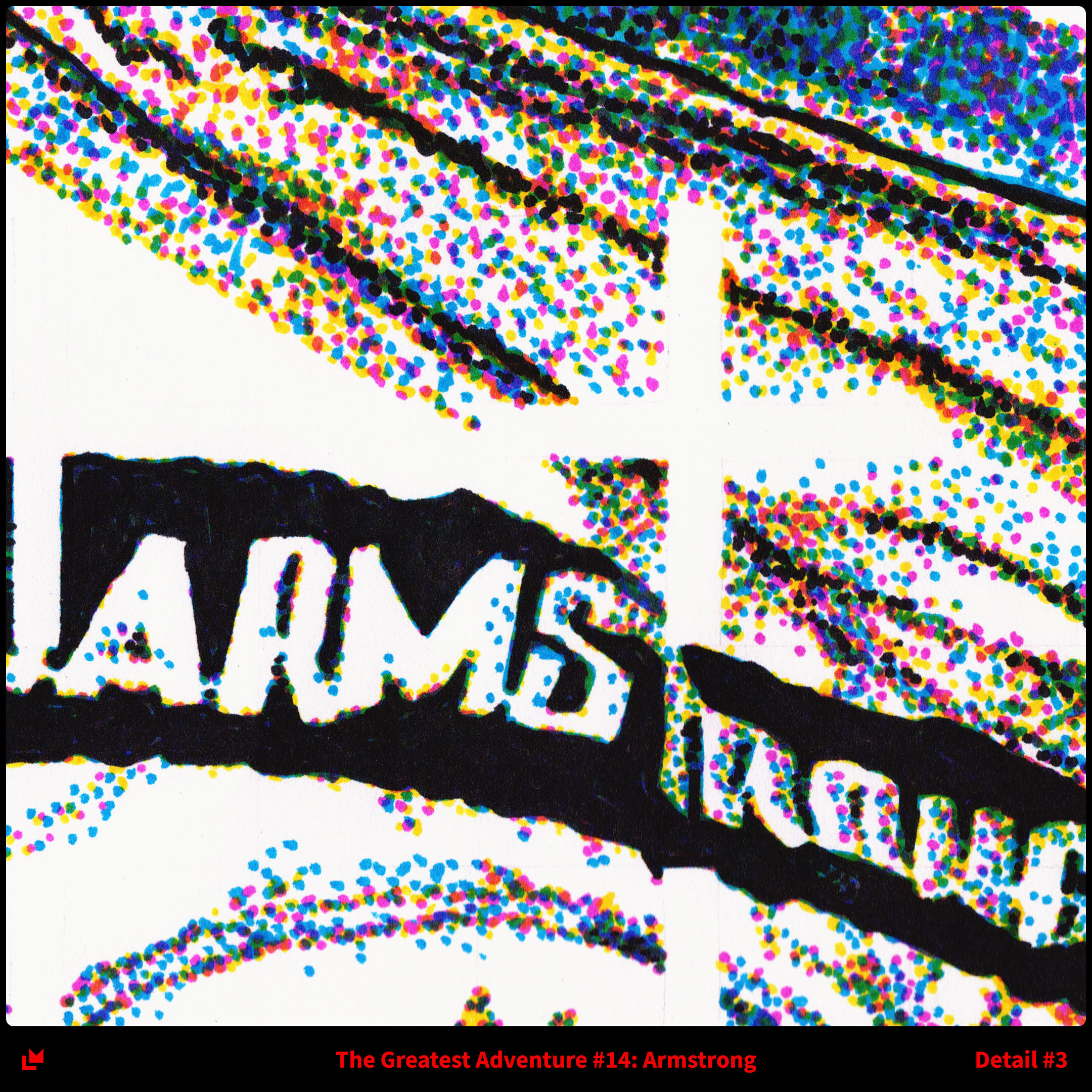
Armstrong 2.0
So here’s a secret, this is actually the second drawing of Neil Armstrong I made for this series. I did a previous drawing earlier on in development but I wasn’t totally happy with it. I had some regrets on my reference image, but mostly I felt the execution wasn’t there. When I had all 15 in this series done, or close to done, I surveyed them and found Armstrong to be the weakest, especially given it’s significance. So I decided to make a new version of it with only about a month before the opening of this show.
The reference image feels heroic, almost like it belongs on a pulp magazine cover. I also like the strong blue background, and any chance to draw metal is appreciated. Overall, it’s definitely an improvement of the previous iteration.
By this point I had worked in this 4-color dot technique so much that it wasn’t a big deal to make this. I followed my usual Photoshop setup, isolating the channels for reference and doing a full pass with a yellow marker, then magenta, then cyan, then black. I drew a grid for ease of transfer and my graphical overlay was outlined by printing out one hash mark at actual size and tracing it on the paper.
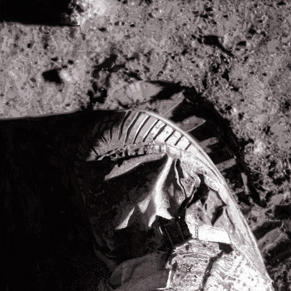
The Small Step

Title: The Small Step
Artist: Luke McCready
Date: January 19th, 2019
Medium: Grayscale Marker on Paper
Size: 24 x 36 inches
Just a step
I could have made the final image of the series something celebratory to capture the elation of a momentous and historic accomplishment, but I decided against that. It’s more powerful to conclude The Greatest Adventure with something absolutely simple, just the act of touching something, just a step on new ground. The stillness and quiet of the moon as a destination is incredible contrast with the high drama of the journey there.
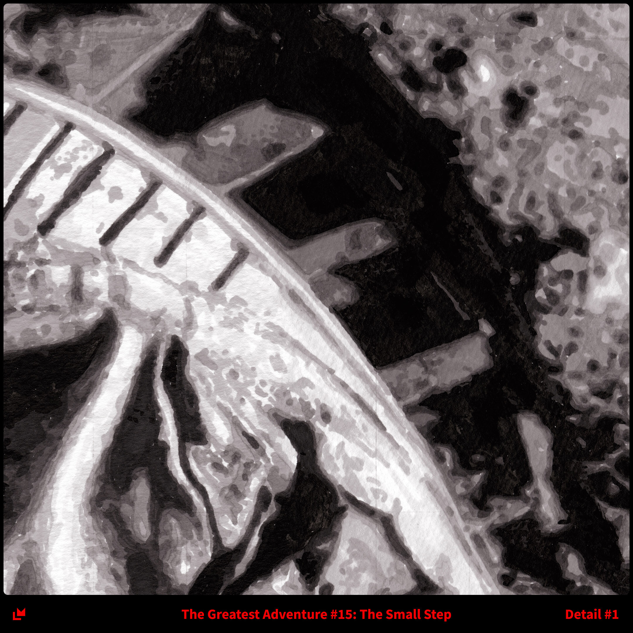
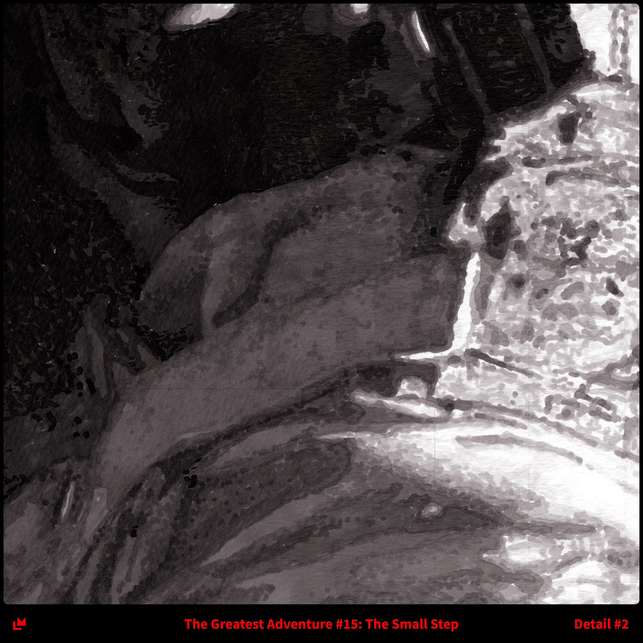

A complete story
Perhaps the most famous and iconic image of the moon missions is a simple photo of a footprint in the lunar regolith. You’ve definitely seen it before. I chose to use a different but related image for this drawing. Although less famous, this photo of a boot making the footprint tells a more complete story.
As with all of the other grayscale drawings, there’s a frame element and a part of the drawing crossing in front of it to represent breaking barriers. The leg of the astronaut was the most obvious answer, but my reference photo didn’t have enough of it in frame given my composition. I actually painted more on in Photoshop, about 3 inches, to make it extend to the edge.