
Anthology Vol.02

‘Anthology’ is a series of pieces made as stand-alone works of art, not tied into a larger series. These range from sketches and experiments to large scale and time-intensive works. Presented in chronological order, these pieces often represent a moment of discovery. Ideas explored here can come to full fruition in a future series. Vol. 02 covers a relatively short time period focused on sketches and experiments with new media.
Table of Contents
La Grande Jatte Remixed
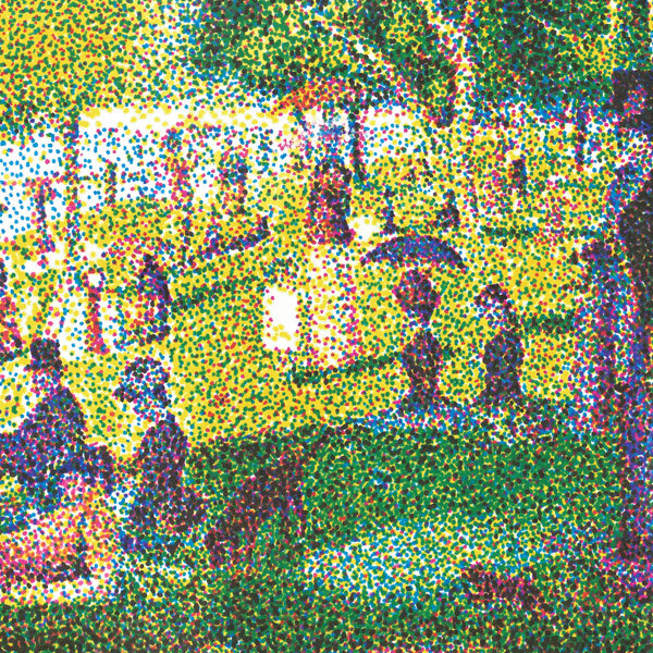
Title: La Grande Jatte Remixed
Artist: Luke McCready
Date: March 15th, 2017
Medium: 4-Color Prismacolor Marker on Paper
Size: 12 x 9 inches
Reinventing a classic
This piece is a small test image meant to further explore the 4-color dot technique I first used in my drawing of John Glenn. The idea with this specific piece was to directly reference the classic art work ‘A Sunday Afternoon on the Island of La Grande Jatte’ by Georges Seurat.
The Seurat original painting is an example of pointilism, where small dots of pure color are applied, and blended optically in the eye of the viewer. My 4-color marker technique is the same principle taken to the extreme.
All printed images use 4 ink colors, cyan, magenta, yellow, and black (key). I’ve used markers and dots to approximate this, creating a modern reinterpretation of a classic.


A vacation
The process here is the same as my previous drawing, ‘Glenn’. I used 4 different colors of marker in layers to create a color image. Getting the right density of each in a given area creates a ratio between all 4 that can produce any color. This drawing came together really quickly because of the small size. I did this drawing over a couple of days during a family vacation.
Furiosa
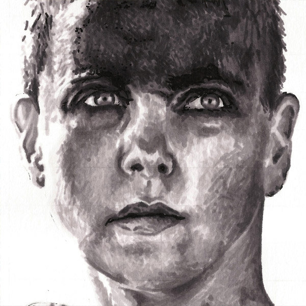
Title: Furiosa
Artist: Luke McCready
Date: March 27th, 2017
Medium: Grayscale Marker on Paper
Size: 9 x 12 inches
Another test
This drawing was primarily a test image for using grayscale markers. I wanted to try a more complex image from what I’d done previously. I chose this image mostly just because it’s a cool image and I really like Mad Max: Fury Road.


Learning opportunity
This was an important learning opportunity for using grayscale markers. I went in without much of a plan and learned quickly that trying to just put down tone is not the most efficient way to use this technique. If I wanted to make an area darker, I would have a hard time knowing if I needed the 50% gray or a different one. There was a lot of going over the same area multiple times with a marker that was too light. When I used this medium in the future I knew I had to be more strategic about what tone to put where.
'Star Wars' Poster Triptych

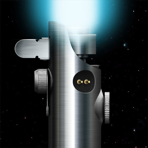
Title: 'Star Wars' Poster Triptych
Artist: Luke McCready
Date: May 4th, 2017
Medium: Digital Illustration
Size: 24 x 36 inches (x3)
May the 4th
This triptych started as a fun side project for myself to develop my digital art/Photoshop skills. I love Star Wars and had this idea for doing this series of minimalist posters. I started with the third one, which was fairly simple, and the other two got more complex. It ended up being a real challenge in the end, especially since I wanted it finished by May 4th, requiring an all-nighter.


Shapes and gradients
This is an entirely Photoshop project. I came into this with a ton of Photoshop experience from my job doing web design, but I hadn’t done much illustration like this before. The body of the lightsabers is done with just a complex linear gradient over a rectangle shape. I’d then just add in a metal texture and some highlight and shadow layers. This started out simple but as I went along I got more and more interested in the details and trying to chase photorealism. I got more interested in other textures like rubber on the grip and added scratches and texture. My favorite part, which I did toward the very end, is on the left image, the socket with the two gold prongs. To me, it looks really realistic like it was a 3D render, but it’s just a 2D composite of shapes and gradients.
If I were to do this project over again today it would be a great candidate for 3D. Modelling the lightsabers and doing some photorealistic lighting and textures would produce a really cool result.
Audrey

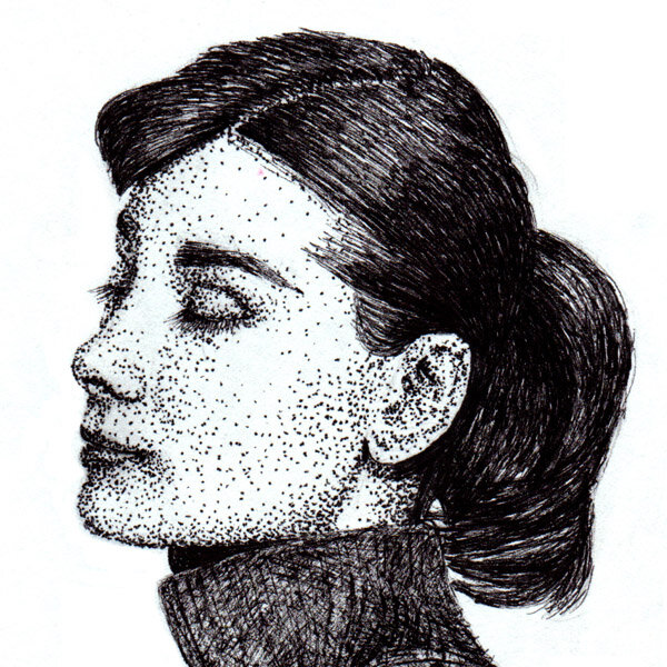
Title: Audrey
Artist: Luke McCready
Date: December 10th, 2017
Medium: Pen & ink on Paper
Size: 8 x 10 inches
Quick drawing
This is a quick drawing of Audrey Hepburn I did when I was bored at a Christmas party. I had a sketchbook and a phone so I pulled up this image and drew it.

Just went for it
I’m actually pretty terrible at sketching, I rely heavily on photo references and aides like grid transfer. For this, I had a photo reference but didn’t use a grid, just went for it, which was difficult, but it turned out pretty good in the end.
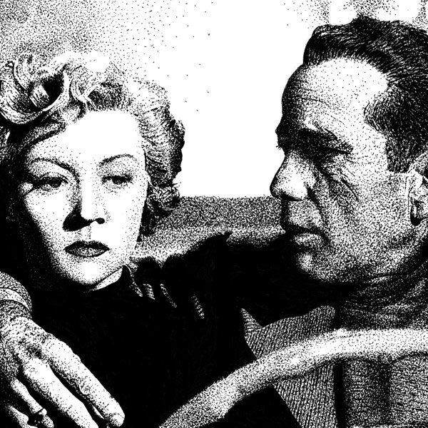
Lonely Place

Title: Lonely Place
Artist: Luke McCready
Date: February 16th, 2018
Medium: Pen & Ink on Paper
Size: 10.75 x 7.5 inches
Tense and murky mood
The reference for this image is a still from the 1950 film noir classic, “In a Lonely Place”. The film has a wonderfully tense and murky mood, and this still encapsulates that. At first glance it seems like a couple in a car, but upon further inspection, there’s a dark undercurrent of tension, the man’s face is in shadow, he assumes a menacing quality.
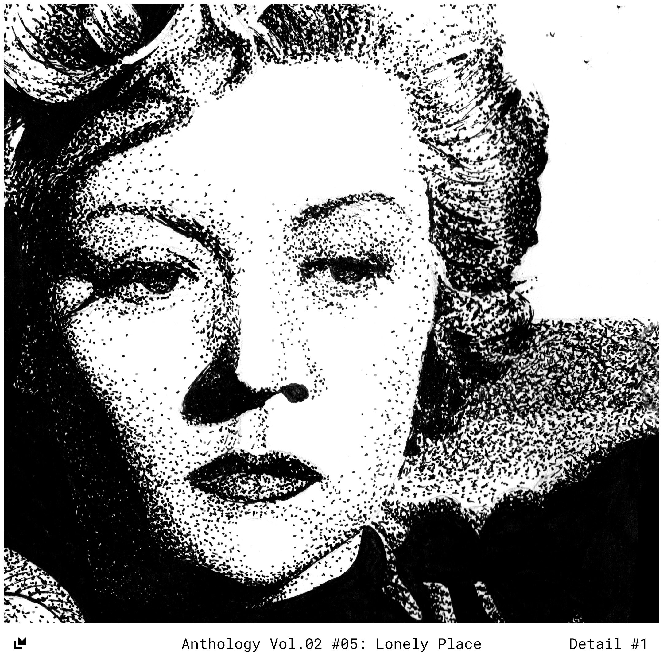
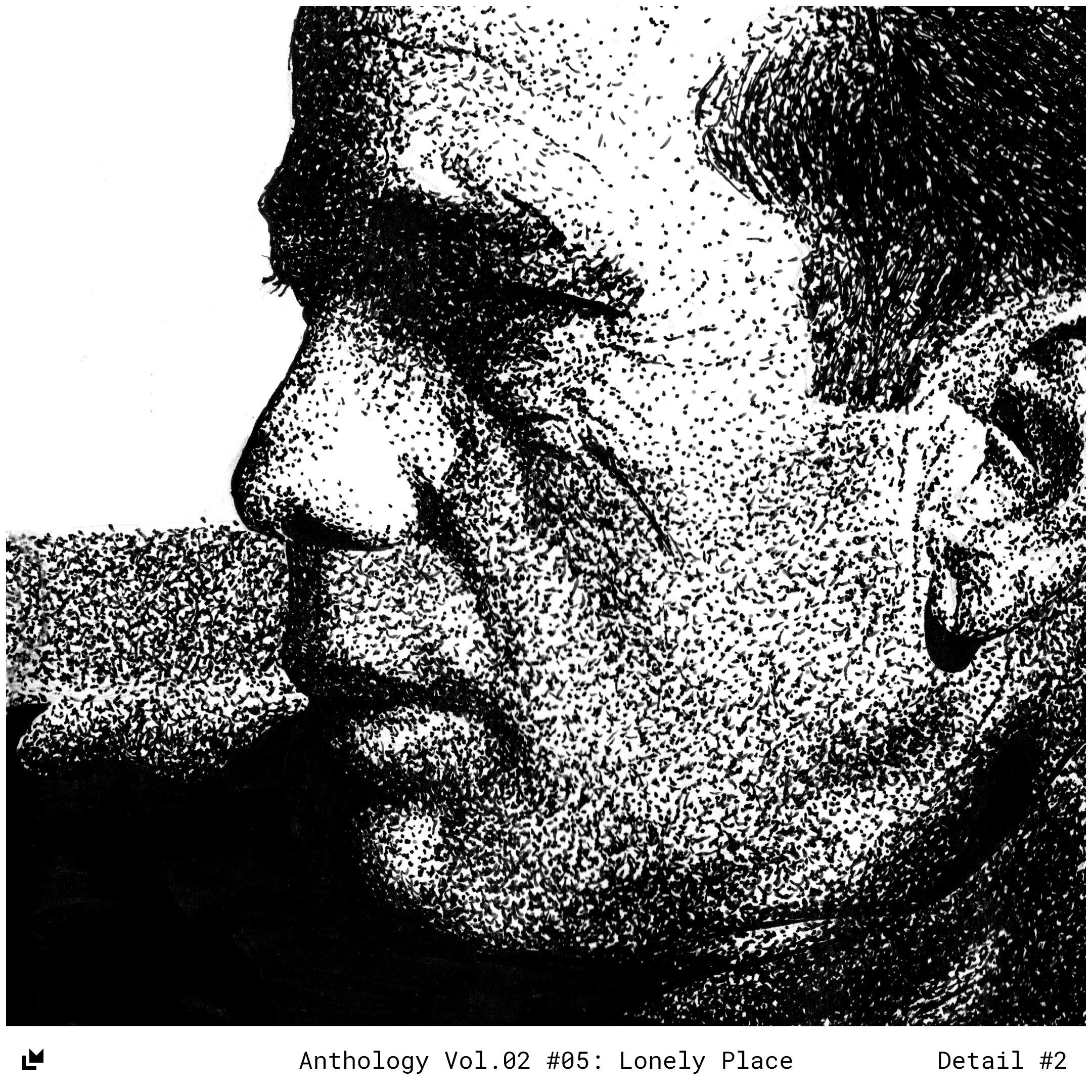
Sketchbook drawing
I did this entire drawing in the two-page spread of my sketchbook over multiple weeks. I used an extremely fine point pen to make the most precise stippling drawing I’ve done so far. I’m really pleased with the technical execution here, the dark grays are pushed far enough, the blurred back ground works, and the textures make sense.
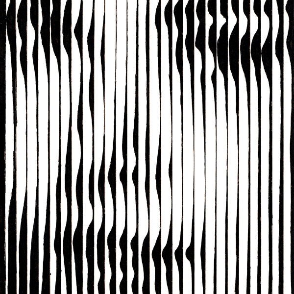
Grace Lines

Title: Grace Lines
Artist: Luke McCready
Date: April 10th, 2018
Medium: Pen & Ink on Paper
Size: 5.375 x 7.5 inches
Extremely experimental
This is an extremely experimental piece. Because of the limitations of this technique I wanted a very zoomed-in portrait so I chose this image of Grace Kelly. There’s not much more to it than that, the image is almost irrelevant as the process is the real star here, but portraits work best because the human brain is supercharge to recognize faces and you can hijack that to power through a lot of abstraction that stands in the middle.

An analogue digital image
This is another drawing that I did in my sketchbook, refreshing an idea that I developed during my Lines on my Face series. I consider this an analogue digital image, or in other words, a digital image rendered through an analogue medium. Each column represents a single pixel width, this image may be drawn with pen, but it has a measurable resolution the same as a raster image.
The line increases or decreases in thickness representing the value of the area represented, essentially a line graph of darkness or lightness. I had this image open in Photoshop, at the corresponding resolution, and I sampled each pixel to see where the value fell on the grayscale. I tried to match that as best I could and connected the dots along the edge, smoothing it as I went along. Interestingly, if you measure horizontally, there’s a discreet number of pixels, but vertically is infinitely smooth, giving the image properties of both a raster and vector image.
from a distance, the individual lines blend optically, creating something extremely realistic and photographic. Up close, however, the face almost disappears and an abstract field of wavy lines remains. This is almost a magic trick, and a technique I am very eager to explore in the future.
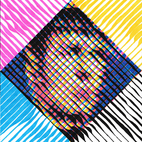
Spock Test

Title: Spock Test
Artist: Luke McCready
Date: December 1st, 2018
Medium: 4-Color Prismacolor Marker on Paper
Size: 7 x 9.875 inches
Jump start the process
Here’s an interesting one. This is a very experimental drawing that combines the principles of my 4-color dot drawing I’d used in a bunch of places, and the varied line thickness technique I’d used on Grace Lines. I knew I wanted another portrait, and one that was somewhat recognizable to jump start the process in the brain of interpreting this, so I chose an image of Mr. Spock from Star Trek.
I did this drawing in a sketchbook over a vacation weekend in Arizona for my friend’s wedding.

A proof of concept
The concept here is to use varied thickness of lines to create tone, areas of light and dark. Doing this with just black ink creates a black and white image, but the same thing works in color if you obey the right color theory. Like my previous versions of this technique that utilize dots, I started with yellow, then moved on to magenta, cyan, and finally black. I built all of this on a grid, but to keep things looking right I had to change the direction of my line 90 degrees for each color. Otherwise all 4 lines would occupy too much of the same space and leave too much white, resulting in an image that doesn’t look right.
for added effect I turned the entire thing 45 degrees and had each color extend off in its own direction, creating a central diamond shape. This isn’t necessary for the technique, I just thought it would add some visual interest and make it clearer what’s actually happening here.
Overall, this image is a proof of concept. I wasn’t sure if this would even work, but now that I know it does I fully intend to do more with it. A way to make it better would be to go bigger. A larger piece of paper with the same or smaller grid size would result in effectively a higher resolution image that would be easier to read.
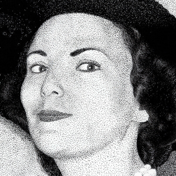
Genevieve
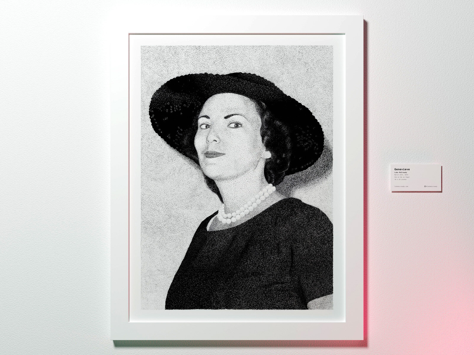
Title: Genevieve
Artist: Luke McCready
Date: March 25th, 2019
Medium: Pen & Ink on Paper
Size: 18 x 24 inches
A commission
This drawing started out as a commission. I had a friend from church who was a fan of my drawing style so she asked if I would be willing to do a portrait of her grandmother Genevieve. I was in the midst of working on The Greatest Adventure and wasn’t sure if I would have the time, but I agreed and managed to complete it. I’m glad I said yes because it turned out really well and she was really pleased with the results.
I think this is my first official art commission I’ve ever done and it worked out. I would be open to doing more of that if the right project came along.


A lot of dark gray
This drawing is done mostly with dots, which is a fairly time consuming way to work, especially on such a large drawing like this. The biggest challenge for stippling is dark gray. It requires so many dots per a given area, and if you apply them randomly you get a higher likelihood of landing on an area already covered. This means that as the gradient darkens in a linear fashion, the number of dots need increases exponentially. This drawing has a lot of dark gray. It can be a tendency for drawings like this to mentally readjust your value levels and settle on an overall lighter interpretation. This is something I work hard to avoid, as a strong dynamic range really helps a drawing succeed. Overall, I’m really pleased with how this turned out.
Sideways

Title: Sideways
Artist: Luke McCready
Date: May 24th, 2020
Medium: Digital Drawing
Size: 5400 x 7200 pixels
A new tool
This project is the first proper piece of art that came out of my acquisition of an iPad Pro. I was hoping to breathe some new life into my artistic life and have fun again, and I think that goal is being achieved. This is 100% digital art piece, replicating a pencil drawing.
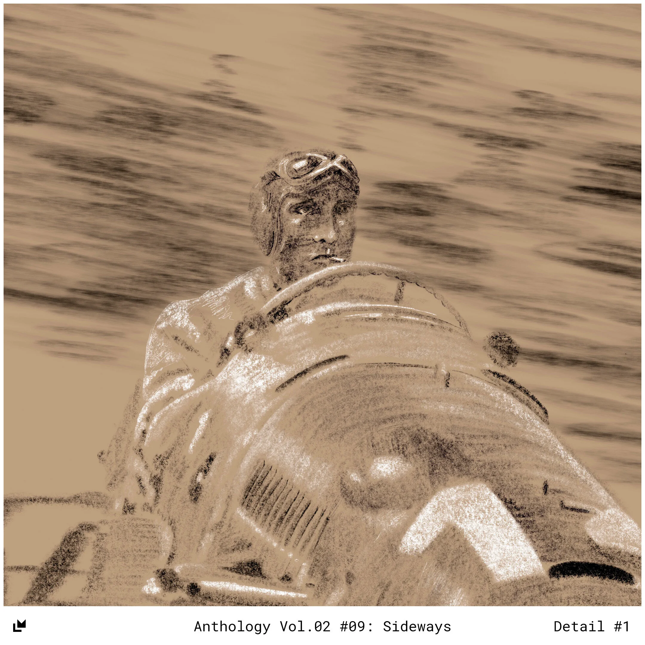

Purely digital
I don’t do purely digital work very often, so this was a new experience for me. Overall, the workflow is pretty great once you get used to it. You have more control over things like layering and erasing, not to mention the cleanliness and portability of it. I do miss the tactile sense of a real drawing, and having a physical item when I’m done. This is something I’m excited to explore in the future.
Katie
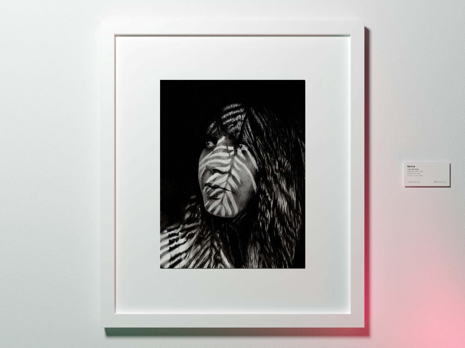
Title: Katie
Artist: Luke McCready
Date: September 20th, 2020
Medium: Graphite on Paper
Size: 13.25 x 17.25 inches
A little help from my friends
The initial idea for this drawing came about from a desire to move away from photo references that were pre-established artistic and cultural touchstones that people knew. I wanted something more specific to this particular drawing, something that didn’t have a built in audience already. Taking my own reference photos would be the answer, but I don’t have that skill, so as a half-step I asked my photographer friend Kaity if she had any photos I could use for a black and white portrait. I really liked this one, it featured our mutual friend Katie as the subject.


It’s messy
On a technical level, my goal with this was to explore extremely realistic graphite drawing as a medium. Graphite and charcoal is something I’ve worked with some in the past, but hadn’t touched in a while; I’ve favored ink more recently. Overall I think the end result is pretty good, close to what I envisioned.
I honestly could have gone much further into the details though, many artists who work with this medium spend orders of magnitude more time than I did here. The reason I didn’t evolve this fully is because I learned that I really don’t like the medium and process of graphite/charcoal. It’s really messy, it’s difficult to work with, I struggled with the texture variance of difference pencil hardnesses. I guess I just prefer the crisp, linear nature of ink shading. I ended up pushing through enough to get it across the finish line so I could move on.